I know that I can almost do any layout I want using grid, but when I make a CMS collections list I don’t seem to be able to do anything except same row and same columns size. Is it possible to make this sort of uneven grid layout using a CMS collection?
Select a list item and check the selector box, you have an option to style the odd, the even, the first and the last differently.
You can go beyond this by using custom CSS code with pseudo classes like =nth-child.
Here’s a demo:
https://sbx.webflow.io/nth-child-targetting-for-coloring-an-inner-element
@vincent I don’t believe the nth-child solution works for collection-generated grids in Webflow. The only solution I’ve seen is to bring a new collection list in for every alternate style required in the layout, as per Nelson’s recent video Create a custom blog list grid layout with various cell sizes in Webflow — Tutorial (2021) - YouTube
It’s seems a bloated way to go about achieving the end result so if there is a custom CSS or JavaScript option for styling dynamic grids in Webflow, I’m keen to see it : )
it works, my example above is exactly that.
I interpreted @eliapingvinen’s question to be specific to styling in CSS Grid, in which case I personally can’t achieve nth-child styling success with a collection list.
Your example doesn’t seem to include CSS Grid? It looks like Flexbox without CSS Grid. If it does, I’m stoked to see a solution, so thank you.
1 Like
Hi @vincent, thanks for the demo! I have a doubt about how it could work in the case of wanting a design in which the first item occupies an entire column and the other items are in the second column, as I show in the photo.

Hello @eliapingvinen, @Fathom & @Patricia_Rodriguez! hope this helps you.
The process is fairly simply, but does require some custom code. I HAD to do it this way in order to avoid duplicate CMS collections being filtered… resulting in the same items being found.
- Add you Collection List to the page/div
- Change your “Collection List” to Grid
- Click on “Edit Grid” and create the areas + names them (preferably in lower case with no spaces). See attached.
- Create a Custom HTML embed and target the “Collection List” Class that you previously made a Grid of… then target you children with CSS and assign them to their area. See attached.


Hope this helps!
2 Likes
Hi,
I tried to edit the grid template areas but it seems to not allow me to edit the grid template areas when a collection item is in the way. Am I missing something here? Thanks a lot for your help

Do you mind sharing a read-only link and maybe you can do a screen capture to explain what exactly you’d like the outcome to be and the issues you’re facing.
This is not something you can do only using Webflow, you’ll have to add custom CSS properties to move the grid areas into their respective place.
Also, currently you’ve setup grid areas on grid blocks that’s already there… this defeats to goal of using areas in the first place. You should use areas when you’d like to merge grid-blocks to create a custom layout.
~ Rhino
Thanks Ryno, I understand what you mean now. I was trying to set the grid template areas using native webflow earlier, I see now that you used custom CSS to set the areas. It works for me now. Appreciate it!
1 Like
Great! SUPER Happy to hear that! 
Happy developing!
~ Rhino
Thanks a lot @RhinoReign, this really helped me out. In case people don’t know how the custom code part works, here is my code for you to copy:
<style>

.blogs-grid div:nth-child(1) {
  grid-area: big-blog;
 }

 .blogs-grid div:nth-child(2) {
  grid-area: small-blog;
 }

 .blogs-grid div:nth-child(3) {
  grid-area: small-blog-2;
 }

</style>
And this is how my grid looks like:
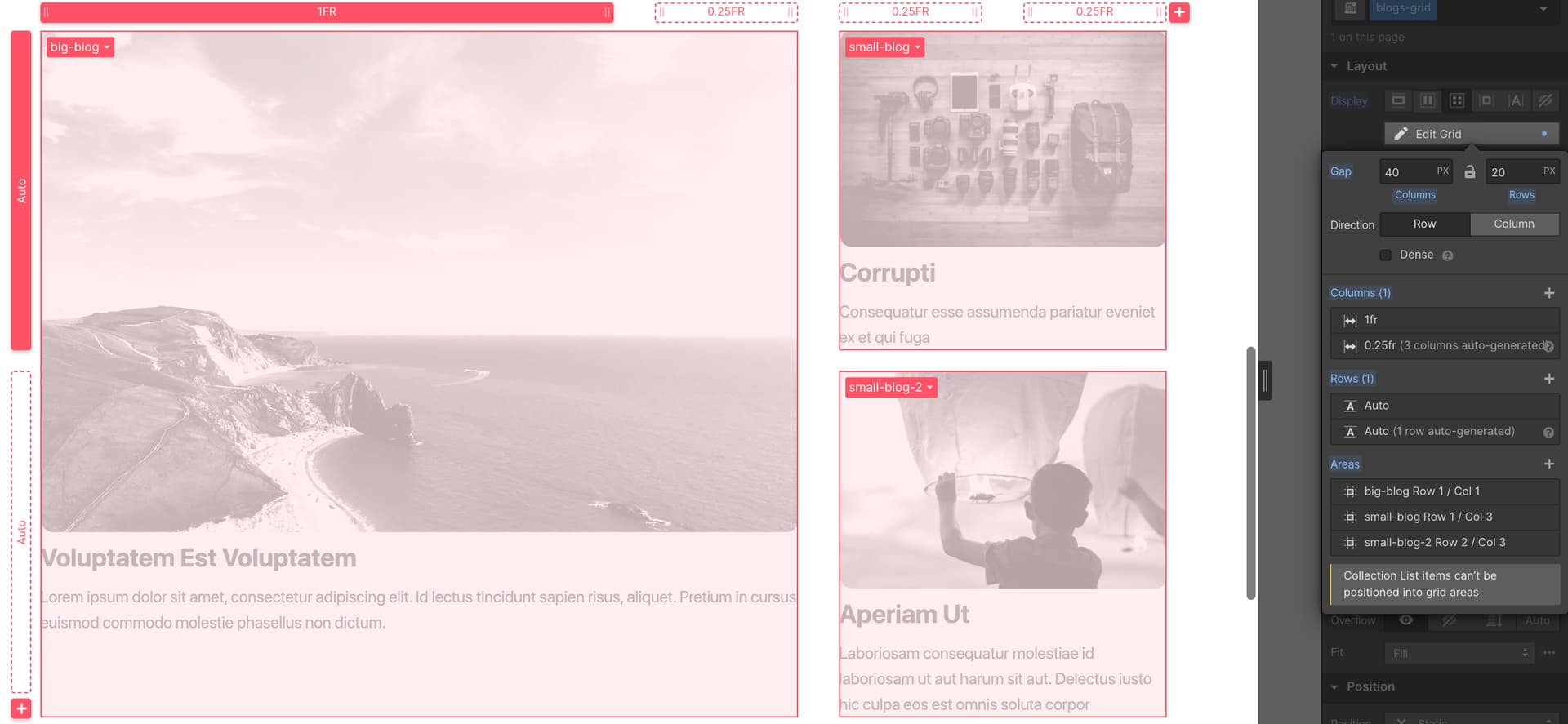
Collection list:

Hope this helps
- Ali
3 Likes
Hello @Ali_Hussain @eliapingvinen @Fathom @Patricia_Rodriguez @RhinoReign,
I have this exact same problem and can’t solve it with the solution.
Can you help ?
Here’s the read-only link : https://preview.webflow.com/preview/hereticcoffee?utm_medium=preview_link&utm_source=designer&utm_content=hereticcoffee&preview=e1424927a9c764fb8378d4b519b61de3&workflow=preview
Thanks a lot.
1 Like
Hey bro,
I got the same problem, managed to fixed it and explained the process
Just search “CMS” and you’ll find the solution here
Let me know if that solves your problem 
1 Like
@AliSaeed Thanks! I tried this solution previously.
I successfully selected my “nth childs” cause I changed the background element (as you can see).
But I don’t know why, grid-area didn’t append the element to the grid area.
You can see it on my read only link below.
Here’s the code I use :
<style>

.collection-item-grid:nth-child(1) {
 grid-area: left;
 background-color:blue;
 }

.collection-item-grid:nth-child(2)  {
grid-area:right;
background-color:blue;
}

.collection-item-grid:nth-child(3)  {
grid-area:bottom;
background-color:blue;
}

</style>
Hey man,
So this is a bit strange. I’ve seen you’ve manipulated the code to make the 3rd child take 2 columns. If you do it normally, it doesn’t seem to recognize the grid-area bottom.
Well it does seem you managed to make it work.
I used the same approach on this site
Read-only link
Maybe you can have a look and see what I missed out.
All the best
it works, my example above is exactly that.
In case someone is looking for another option to work with CMS irregular grids, here’s one that I believe is pretty simple (I don’t code yet) and also helps the client make adjustments on the way.
Thank You Ali, you just saved my life! <3