Hello, I am currently creating a Webflow website and I have been implementing the sections as I go along. I have almost finished the site, but when I published it, I realized that a section I had implemented at the beginning was no longer working properly.
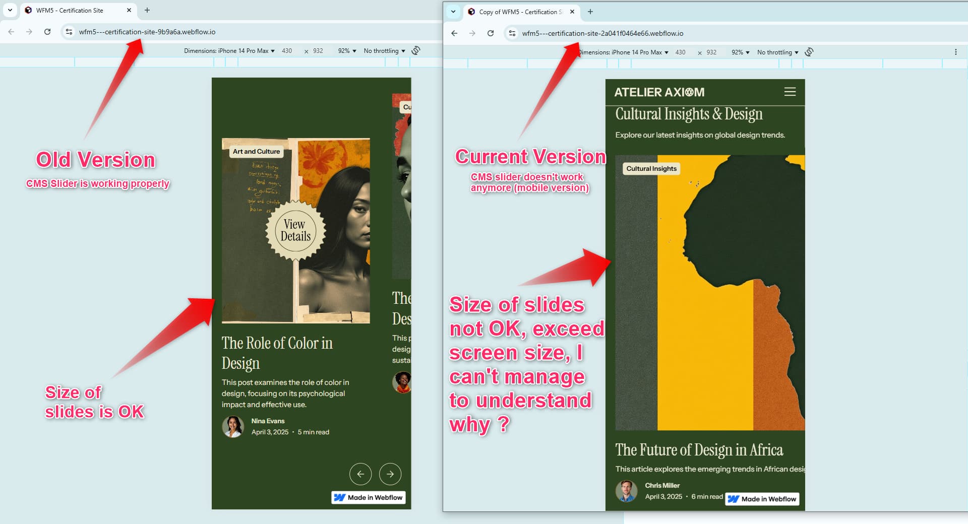
The section that is no longer working is a “CMS Slider” section using the Finsweet component (v1). The section still works on PCs and tablets, but no longer works on mobile devices.
Using my site backups, I was able to revert to an earlier version of my site where the slider works. However, I spent a lot of time comparing the old version of the slider (which works) with the current version of my slider (which doesn’t work anymore), and I really can’t see where my problem is coming from. I can’t find any differences…
Here is a read-only Webflow link to the old version with the slider working (replace the * with t because as a new user of the forum, I don’t think I can post links…) h*tps://preview.webflow.com/preview/wfm5---certification-site-9b9a6a?utm_medium=preview_link&utm_source=designer&utm_content=wfm5---certification-site-9b9a6a&preview=e00868db056a6c6bfb8119ff7f31a95e&workflow=sitePreview
And here’s how the slider behaves on the published site (take a close look at how it works on the mobile version): h*tps://wfm5---certification-site-9b9a6a.webflow.io/
And here is the read-only Webflow link for the current version of the site: h*tps://preview.webflow.com/preview/wfm5---certification-site-2a041f0464e66?utm_medium=preview_link&utm_source=designer&utm_content=wfm5---certification-site-2a041f0464e66&preview=b6edb14ab22758162692a05312f84cd7&workflow=sitePreview
And the behavior of the slider on the published site: h*tps://wfm5---certification-site-2a041f0464e66.webflow.io/
Description of my issue: In the old version of the slider, on the mobile version, the slides obeyed the slide size I had given to the slider mask. On the current version, the slides exceed the screen size, making it impossible to navigate the slider correctly. I can’t understand why the slides exceed the screen size on the current version.
Note: on the old version of the slider, please ignore the “View details” overlay, as I hadn’t finished implementing it on the old version of the site.
Can you help me find the source of my problem, please?
Thank you by advance !
Jean-Baptiste