I’ve read this article over and over again, and the links within it:
https://webflow.com/feature/responsive-images
It all sounds logical. Being a previous Squarespace user, the also served up scaled down images to fit no matter what the original; seemed to work perfectly no matter what I uploaded.
However, for desktop at least, I do not see Webflow serving up the correct image size. It always seems to serve up the original highest resolution image. Webflow guys haven’t been able to make me understand, so maybe one of you in the community can. My main example:
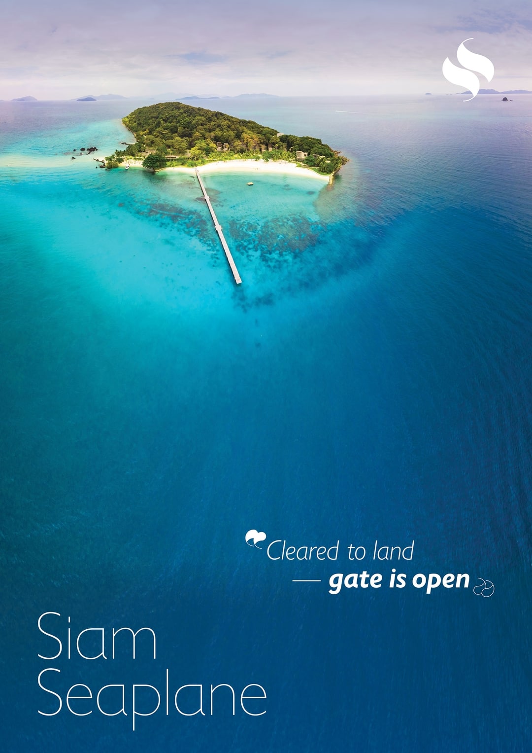
on this page: R. Paul Seymour — Siam Seaplane
— Any of the “poster” images down at the bottom, have “max-width: 991px” in the actual code… however, it always serves up the original 2000px wide, instead of the generated 1080px image, which clearly exists. I don’t understand why this happens? I would assume it uses “max-width: 991px” to determine the next closest image resolution?
I’m clearly not understanding something, because that’s not what’s happening (and, it doesn’t seem to be happening on any page, really). Read only link works below, and should go to the same page as above (if not, it’s the page called “Siam Seaplane.”
Thank you, Paul
Here is my site Read-Only: LINK
(how to share your site Read-Only link)
