Hello Webflow-Community,
I’m currently working on a new project right now, and came across a problem, that I can’t solve by myself.
I have integrated a slider element, that shows a preview of a few sites of a book.
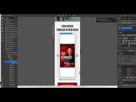
If the dimensions of the slider remain the same, I was able to set specific dimensions for the book pages so that they filled the entire slider. In the mobile view, however, I set the size of the slider in percentages. Here I cannot specify a specific size for the image of the book page and have therefore set it to 100% width and hight.
Unfortunately, this setting does not work here and there is a gap at the bottom of the book pages, as you can see on this picture:
Please ignore the mistakes in the mobile version, I’m not finished yet and working on the details.
But maybe someone here who has more experience than me, can give me a helpful advice.
I look forward to your feedback and thank you in advance.
Best regards
Alice
Here is my site Read-Only: LINK
(how to share your site Read-Only link)


