Can someone please help me with the sliders on my site. The homepage has a slider that looks fine on desktop and tablet but both mobile views shift it over to the left and it gets all wacky.
I know it has to be a easy fix I just can’t figure it out.
Here is my site Read-Only: Webflow - Listing Leaders - Michigan (how to share your site Read-Only link)
Hello,
Your slider seems perfectly fine for me :
Can you be more specific ?
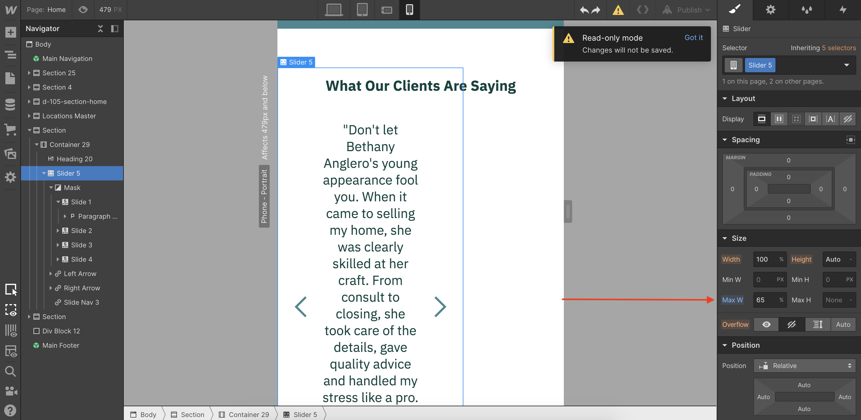
If you scroll down the page you’ll see it towards the bottom. I turned if off for mobile but I’d like to have it on but functional.
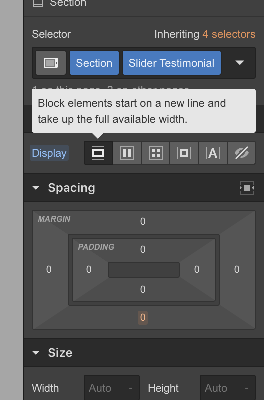
Ok i See !
If you set your section to display block and if you delete the max width of the slider (65% at the moment), your slider will be fully responsive
Don’t forget to do it for every viewport, and you’ll be good, i think !
It worked! Thank you for the help


