Hey!
I’m working on a portfolio project and wanna make square album thumbnail links using grid, and I’d love each thumb to keep perfect 1:1 proportion even upon resizing.
Is it possible with grid?
Here is my site Read-Only: LINK
Hey!
I’m working on a portfolio project and wanna make square album thumbnail links using grid, and I’d love each thumb to keep perfect 1:1 proportion even upon resizing.
Is it possible with grid?
Here is my site Read-Only: LINK
Nope. grid doesn’t work that way. But if you just want your thumbnails to be responsive and perfectly square at the same time there is this neat trick:
The bottom (or top) padding (or margin) for any element if set in percentages is going to be calculated from the element’s width (that’s just how css specs work, there is no common sense here :D). Therefore if we create any grid element as our parent and put our div inside, giving it 100% width to fill this grid element, then adding top or bottom padding of 100% to our child div the result is perfectly square div.
All that is left to do now is use absolutely positioned children inside this div to put content in it and that is all!
Thanks Alex @dram
But not sure I am quite following.
I have a div called “album-img” inside my grid, I gave it 100% width and bottom margin 100% . This produces rectangles for me, not squares. I’ve tried playing with children alignment inside the grid (center instead of stretch), but that didn’t change anything.
When I set this album-img div to absolute it produced something very weird.
Also not sure how do I set up grid columns and rows in that case?
Confused.
Right on the first page.
Thanks in advance
Of course it does hence you need to absolutely position your children inside this div as I said.
Yes, but why did you do that? Don’t 
However you like really, this doesn’t change the thumbnail’s “squareness”!
Ahh, that’s what it is, it’s children, not itself…
Thanks , this works just awesome !
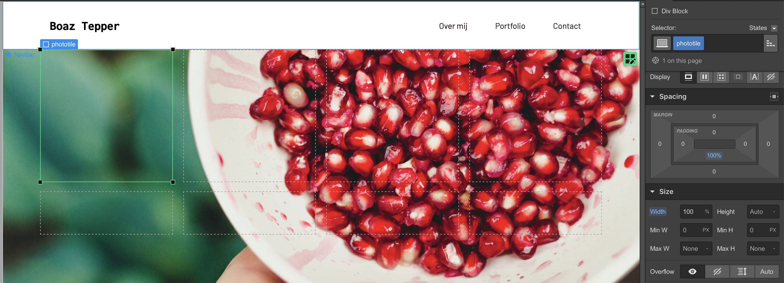
Hey, I am having the same problem, I guess. But the fix doesn’t work for me. What I want to create: an Instagram-style squared photo gallery with pictures that don’t have squared proportions themselves.
If create a grid and place div’s inside it with 100% width and 100% bottom padding, either the rectangular picture just stays rectangular within that squared div, or the image fills the entire webpage. Is there any possibility to let the image ‘fill’ the box, as if you were cutting out the edges of the image?
See my attached images for further clarification.

Change your parent position to anything else but “static”.
Hey, try additionally setting phototile to Relative in Position settings, and Image to Aboslute - Full (I think in that case 100% width and height can be removed for the Image)
I also set grid height and width to 1FR, not 100% positive it is needed though.
Also there is an interesting solution for Insta and Facebook feed https://www.udesly.com/shop/webflow-instagram-feed/
https://www.udesly.com/shop/webflow-facebook-feed/
Thanks for fast reply, you both! Changing its position to anything else results in the images not filling up the div.
But with help of a friend, it’s fixed in a more easy way! We used the ‘width 100%, padding 100%’ technique combined with ‘background image’. Just using the background image tool opened my eyes: this is what I wanted. Selecting an image to fill the shape the way you want and re-adjusting its position where wanted. This way I can create a squared div and place any image inside I’d want.
Thank you for your help again!
Can you maybe help me out? Really doesnt finding how to make them all squared / depending on which screen view .
Hi Charlotte,
I think this should work https://www.loom.com/share/90faca5cfccb4dba9ae1a9ebc3d2bd6e
Not entirely sure why the sections jump a bit when I shrink the page, but maybe this is related to something els
You can check how I did it on my page if you like
Hey!
Same problem, but solution not working.
I’ve set the Child Div inside grid to width 100%, padding 100%. When I set the image inside the Div to absolute it disappears. The two photos to the right seem to be working correctly, until it changes to tablet and they become rectangles again…
Hey Sonja, can you share your project read only link and I could take a look?
Typos courtesy of my phone,
Dmitry
Sure, thanks! I’ve re-done the settings so they’re different from above images now, but same problem remains!
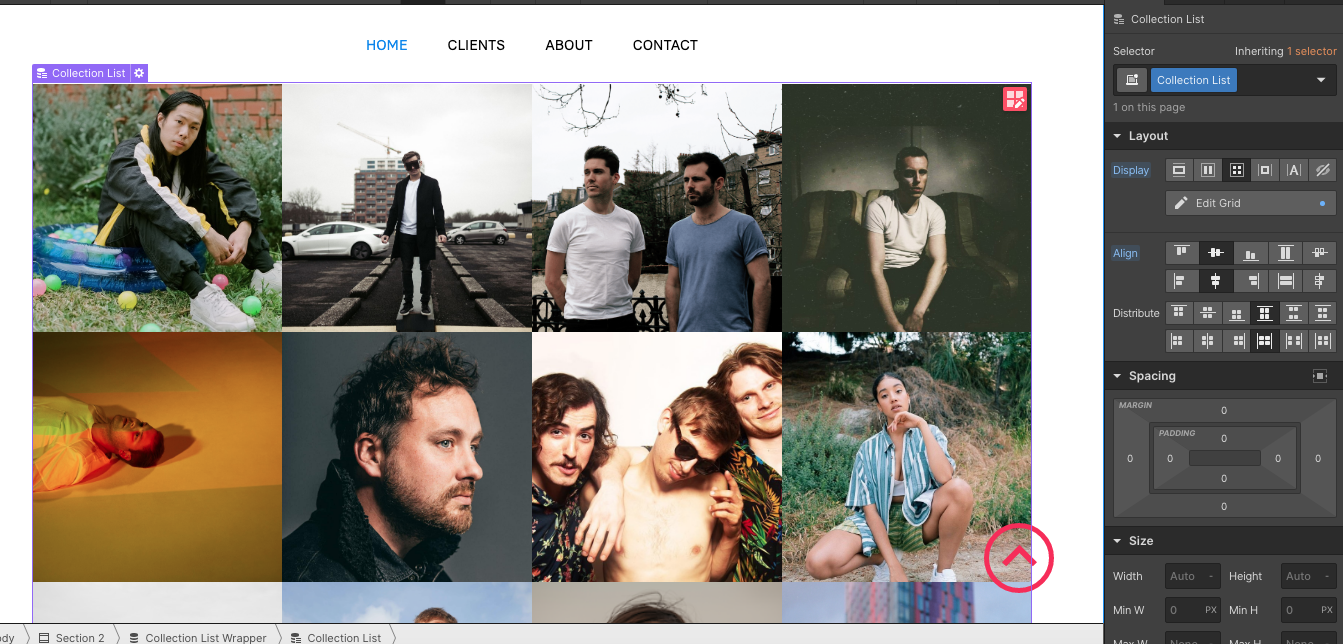
Ok I was able to do it slightly different way. See screenshots. I think the biggest issue is to have the image element inside the div, so I removed it and add another div with the background image set to cover. Maybe there is a way to still use the image, but somehow it feels better not to do so.
I removed the hover div with all the elements for simplicity.
Also you had a lot of styles applied , height, width, min-height, min-width, so I suggest to clear what’s unneeded.
It’s not currently full width of the page, sorry I haven’t figured it out now, but I think it’s achievable with playing with it more. I hope this is helpful
Ok, I think I got it, see the video https://www.loom.com/share/850d96055e61418287b40bbfb234c55a
additionally, set the image div background to Contain.
Wow, thank you so much for this amazing help. I’ve gone through the video, tripple checked all the settings, they seem to be the same, but this is what happens:
https://preview.webflow.com/preview/lpr-936eb2?utm_medium=preview_link&utm_source=designer&utm_content=lpr-936eb2&preview=3f34d338e881353785a187567235884d&mode=preview!Screenshot 2020-09-28 at 16.07.19|690x236
You’re most welcome.
Min W for the Moving Image should be set to 50 VW not 50 % edit: even better 25VW, that’s the only error. And it will probably be better to set “Moving Image” background Image to cover.
But I’d suggest to remove unneeded classes by holding alt and clicking on the blue highlighted setting, just so you don’t have other issues later.
Refer to the images below, I removed some of the unneeded Heights and Widths
Honestly, I can’t thank you enough. I’ve never gotten this good help in a forum ever. You’ve made my life 100 times easier. Thank you loads and I hope the good karma treats you back!


