I am having issues with making my divs perfectly square with a ratio of 1:1 and can’t seem to make it work. The idea is to make the divs retain their square shape especially when resizing responsively.
That’s a cool example website. I took a look in the designer and I’m pretty sure that all of her images were squares to begin with. Additionally, the columns are set to 1FR, which distributes the size accordingly based on the number of elements in the grid.
I haven’t found a sure solution to creating perfectly-square elements, and I’d welcome any solution! But I’ve found a workaround which is to set the height of your elements to be the VW (view width) that corresponds to the number of columns. For example, your grid has 4 columns - you set the height to 25VW. Your result will be square elements.
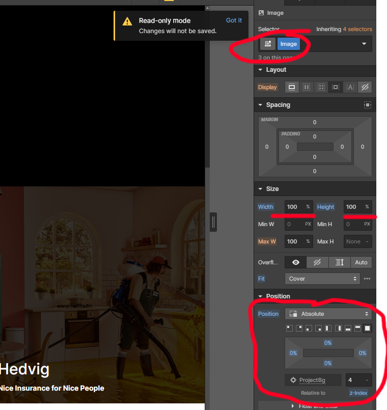
Yeah it seems to only work if the images are square to begin with and within an image element not a div. I have tried the image element route and it works fine but then I’m having issues dropping a div on top of the image element. It seems the only way I can achieve the result I require is by dropping an image into a div as the background, but then I can’t get perfect 1:1 squares
I’ve tried your suggestion using 25VW in the height, without much luck. Thanks anyway!
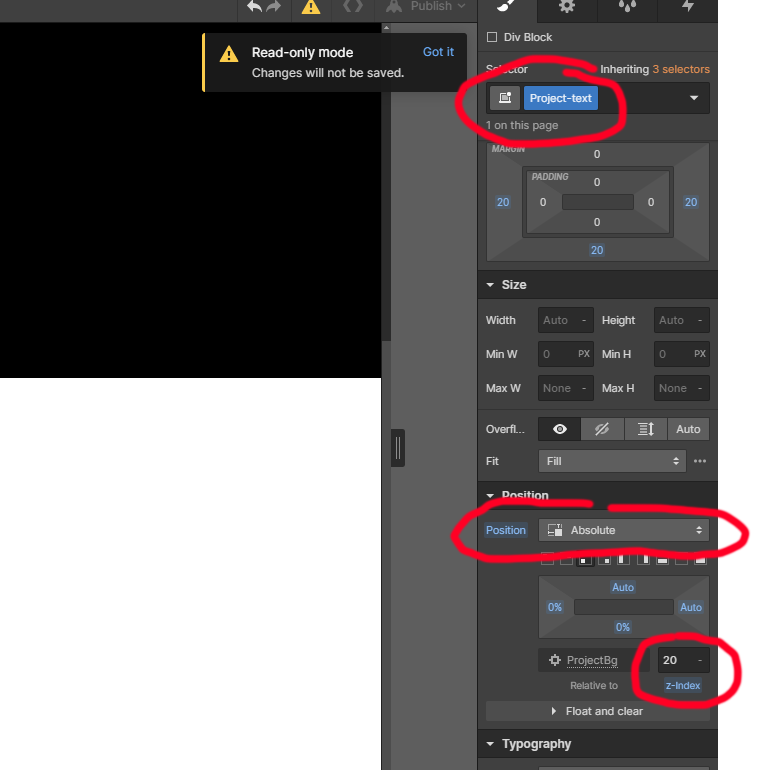
Don’t give up yet! So create your Grid, and inside each grid panel you need a DIV container. Then you can set the background image on the Div to the images that you’re trying to use. Just make sure you position the image-background in the properties panel to fit properly! Once your image backgrounds are set, then you can set the sizing.
Something to note: DIV containers without any elements inside will default to empty - you need to set a fixed width(100%) on the divs. After setting the rows to 1FR, then go to the div height and set that value to the VW of however many columns you have. 4 Columns = 25vw


 Put any image size you want:

