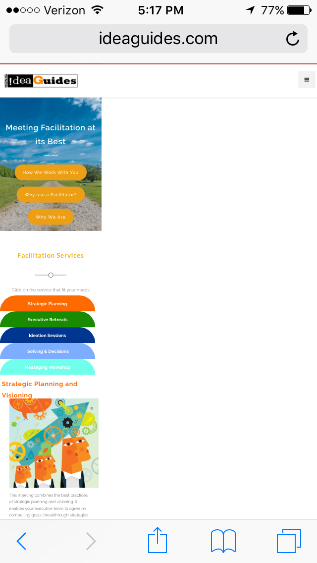
The screen in the mobile portrait in the Webflow design site does not match my iPhone (for the following pages meeting-facilitation, training and team-building). On the iPhone it is very small (see attached). Can you please tell how and why this is and help me correct it?
Thanks Sabina that worked. But now the Navigator for the mobile Portrait view does not seem to work. I did not make any changes to this… Maybe it didn’t work before.

