PLEASE HELP… my churchhealthresources.webflow.io testmobile page portraite phone HUGE Gaps and Trouble with footer not fitting where it belongs and showing up right when uploaded… I am a mess have worked so hard on this and still cannot get all these divs to fit just right … Am I supposed to use HUGE Top Margins to push divs to the bottom??? not sure what is wrong totally with this mobile layout for TESTMOBILE page … I thank you in advance for any and all help… this is really slowing me down not getting this right… HUGE GAPS and problems placing footer properly in Portrait PHONE… see screen shot as well… thank you so much for the help. bruceo
---------- IF POSSIBLE COULD YOU PLEASE PROVIDE ME A VIDEO … PLEASE GO SLOW … SO I CAN FIX ALL THAT IS WRONG HERE… I thought I did fine on the Desktop version but this is difficult for me… any and all help is appreciated… bruceo
I created a screencast for you where I fixed all issues for making your home page looks properly. Other pages look depends on many of classes that been used on the home page. Unfortunately, there are many more moments which you will have to fix before the whole site will look correct. But lets start from this page and then I will show you next steps. https://drive.google.com/file/d/0B-7cg8BSq1Z_R2M1U1VRaDE1T00/view
Sabanna Wow that was a wonder set of fixes… Could you please help me with my testmobile page in a video?
I will work on the homepage but it would be really great if you could help me with the testmobile page… the other pages I did not attempt to optimize for mobile ready except for the testmobile which is the seminars page if I could get this rolling I should be in great shape… as I know this best and I could learn really fast by your working on the specific page…
I did view the video like you asked… just have been very stumped with the issues on the testmobile page… I know you are busy but it would really help. mean while I will go in and fix up the home page… I am sure I will learn a few things that I have been dealing with on testmobile… but again I could use the help… thank you so much … this was a template and maybe this could have casued me some confusion … next site I will build from scratch and hopefully it will look cleaner…
Sabanna thank you for such a fast response… I am eager to get working and to hear back from you… bruceo
Like I said, I will help further, but after you will add changes to home page, because classes on other pages depends on it. So more you fix on home page - less issues will left.
Sabanna I believe I have these changes updated. It took me a while … thank you for the help…
Since we are going to do the other pages I believe we can skip the seminar page and build the testmobile … when done with this page I will delete the current seminar page then RENAME the testmobile page to Seminar. I will be ready to go forward when you are… the video was EXTREMELY helpful.
I did want slightly different Navigation from HOME page to the other pages… hope that won’t mess you up… the nav seems to be what I had desired and I don’t think need fixing…
Hello Sabanna, I proceeded to make the changes to the testmobile.html page… then gave it the correct name and removed the OLD sminar page…
A couple of issues …
in design mode and even using preview looks good for top title Medic I Pastors’ Seminar but in the real world online in Portrait Phone it is hiding behind the Medic I picture see ATTACHED jpg checked at ipadgeek.com and also on my Samsung Note 4 smart phone… 2. When I get in there and try a few things I FAIL to keep everything looking good can’t fix on my end … sorry but I still need your help please…
Where can I go to RENAME the Page TAB that shows up in Browser… it is showing Different Studios as if it was the Page Name… I hope you can show me where to change this out THROUGH Webflow please… I need to learn how to do this on my own one of these days…
Are you willing to help me finish the rest of site? I would appreciate it very much… AGAIN THANK YOU SO MUCH FOR ALL OF THE HELP…
I am not sure that I correctly understand you, but if you want to add page name, which appears in the browser tab you can find it in page settings panel:
Sabanna, you are awesome !!! Thank you so much for the help…
Yes I was able to Fix the Title and that removed the Template people…
This is a very nice site and MUCH MUCH better with your help. I will very carefully try to remove stuff on remaining pages based on what I saw you do and maybe I can make headway so when you get a break and can go over my remaining pages they won’t be so bad…
Eager to hear from you when you get the chance… Bruceo
please see jpgs uploaded Home page Payroll Section OK on Home Page. bottom border not showing in slider cannot fix… on one slide also need Tablet and landscape image adjustments… not looking good in IPad chopped off images… a mess
I have worked and worked to add data and get this site looking as clean as I can without getting weird settings in position areas… Used Auto as much as I could but I have failed … still having some issues… I think we are pretty close… PLEASE take a good look at all of my pages once we have figured out the first 2 issues… just to make sure I am running as CLEAN as possible… You have been so helpful I really appreciate the assistance… BruceO
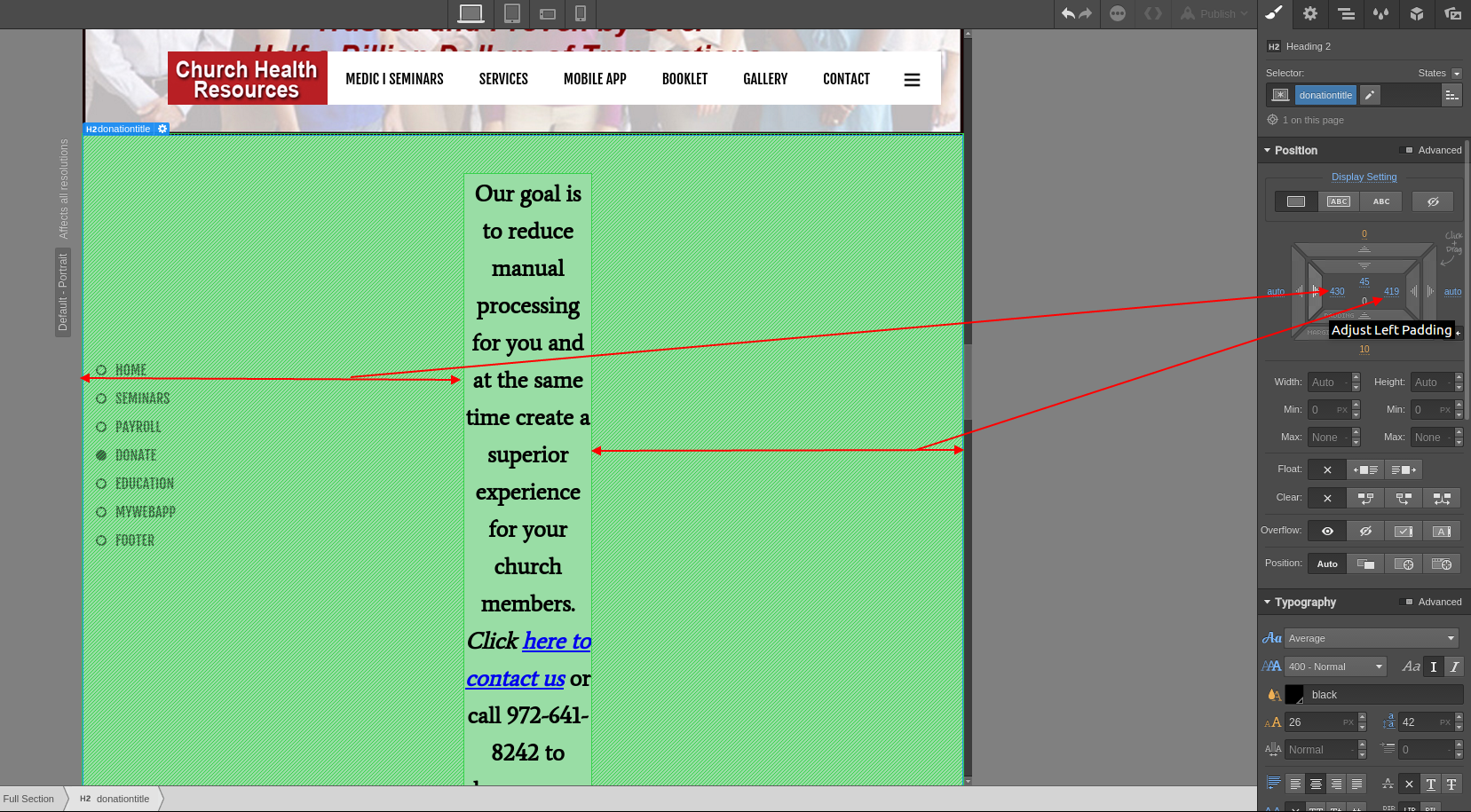
Hello Sabana, thank you for all of the help… we are down to one issue found using IPadgeek.com when using the landscape tablet view the OUR Goal Title text in the HOME PAGE Donation Green section becomes extremely narrow??? does not do this on all others… I tried to fix thisby giving a class to the Title but failed… but just don’t know how to fix…
I noticed when taking the design mode using tablet and then sliding it wider I get the same ERROR showing up at 982 I believe… if we could fix this then it should be working fine on other tablets landscape … it looks rather dumb and I cannot live with it… if you can help me I think and hope this is the end for now… you have been extremely helpful as I continue to learn more on how to do this… BruceO
Hello, I am STUCK worked for hours trying to get a fix but am happy to say I repaired other issues … I have a huge white space on right of tablet and phones portrait WHEN VIEWING HOME PAGE …looks great on Desktop cannot remove please please take a look and see if you can figure where this problem is… in other words we can scroll to the right even though the content is lined up nicely…
I hope that this is the end … thank you for taking another look… I am taking a break while waiting on your repsonse… something is not registering with me for me to have this issue show up again… bruceo
Anna, thank you so much for the help… I was able to get all sizes working right and sliders working pretty acceptable… I learned a lot on this project… thank you so much … I am going to start adding alt titles and SEO stuff on the pages. I will need to get a facebook page running so I can add FB icon in this site as well… been so busy…
Again thank you for helping… I feel pretty lonely on this end as far as webdesign is concerned… If people in the forum like yourself did not help I would be in a very big HURT.


