Hello everyone,
I have been using Web flow for a couple of weeks now to build a website for my teams production company. I am loving Web flow so far it’s awesome! The only issue I am having is with getting things set up for mobile. The biggest issue I have is there is a huge white space on the right side and I don’t know why. Another reason is i’m having a problem where allot of items aren’t centered on the mobile version, if you guys can help me out or give me tips it would be greatly appreciated.
Thank you in advance!
https://preview.webflow.com/preview/sleeping-giant-2?utm_medium=preview_link&utm_source=designer&utm_content=sleeping-giant-2&preview=0ccd586ab2eae0b5fffbaab4177e620f&mode=preview
Hi @Nzskyy, welcome to the forum. I have seen your read only link. I think there are alot of things for you to correct.
Few things you can start doing:
-
Use margin & padding to move/space things around. Try to avoid using Position to space things out, especially if you’re just using Position: Relative.
-
To answer your question on the extra space on the right. You have a video which has a width of 134%. That means its bigger than the screen. For it to fit the screen it needs to be 100%.

-
And avoid this, where you cancelling off the -2358 with the 1526.

This is a great resource for you to familiarise with CSS and the box model: The CSS Box Model | CSS-Tricks - CSS-Tricks
1 Like
hey @dennyhartanto, thanks for some of the advice! As you can probably notice by now I am very new to this program haha. I’m still having the issue of having a large empty white space on the mobile version, I got rid of the background video and still nothing. Any advice?
Hi @Nzskyy, I’d suggest you to pick up the fundamentals of CSS before moving forward. This will save you tons of time.
As for the white space on mobile.
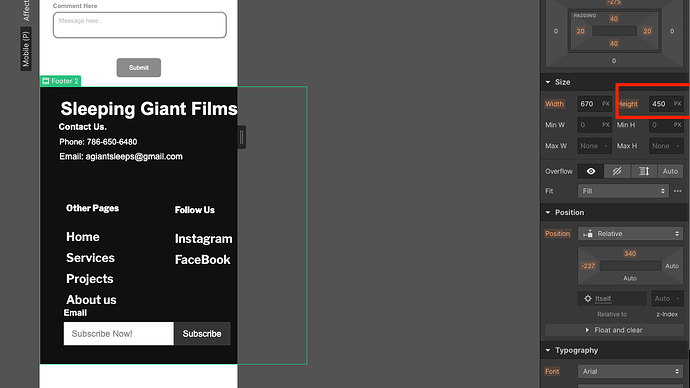
You have set a height for the Footer, while the the content is much larger than the Height.

Although there are other things I would fix too. The quickest solution for you is to just set the height to Auto. This just tells the box to expand/contract based on the amount of content inside it.
@dennyhartanto Okay so ive learned allot from that article and it is getting MUCH BETTER!
The last part i’m having difficulty with is the gallery section where i show the different types of projects we have done to show people on the site. The idea is just simply one by one on top of the other be there but the Grid system is very confusing. I shouldnt just be manually positioning everything correct?
@Nzskyy Well if you want to achieve the layout that you are using now, yes you have to manually position it. Unless it involves some custom code.


