Hi everyone,
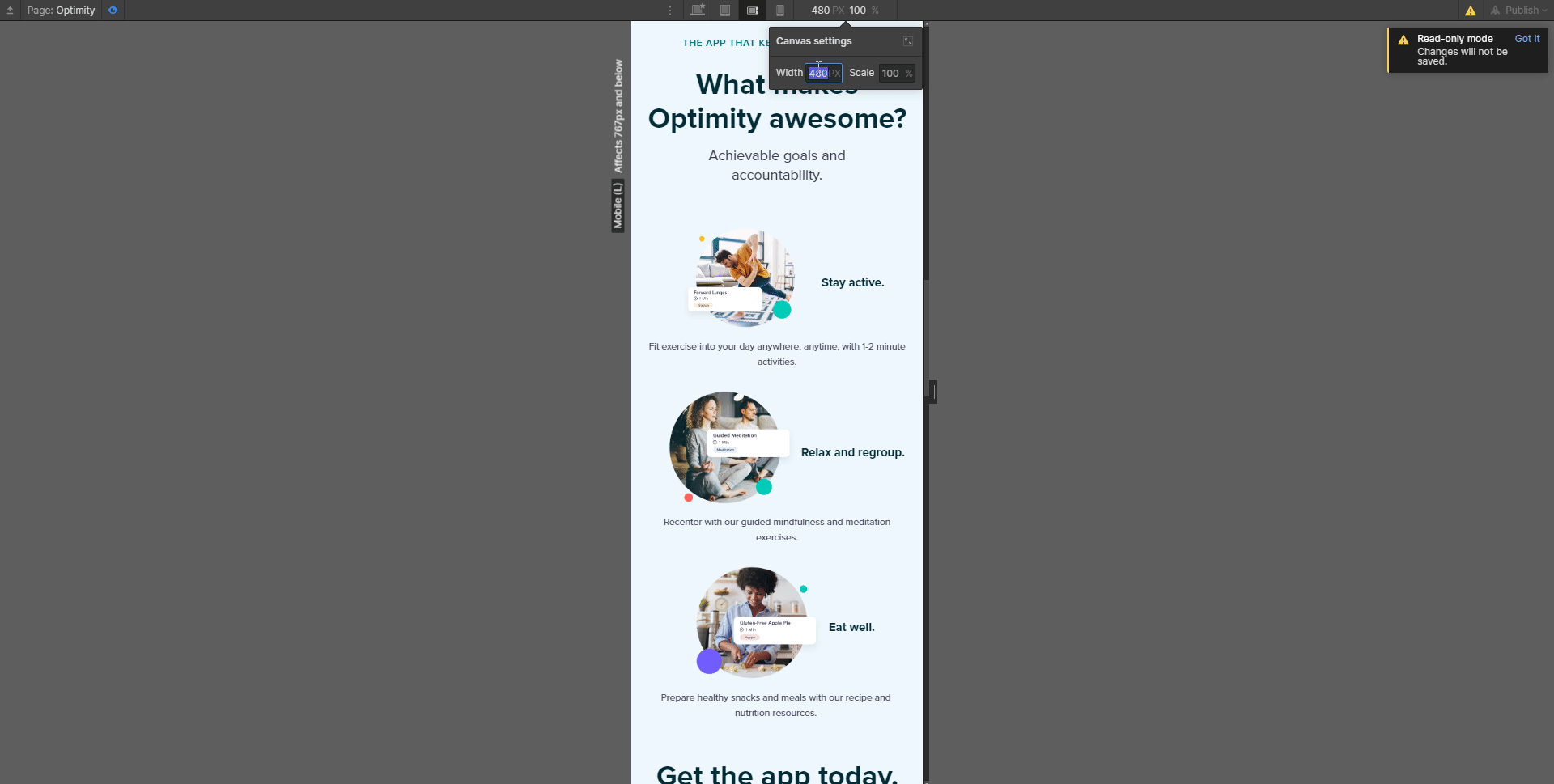
I need a little help with a particular section of my site… it’s set up as columns, and when I get down to sub-479 width devices, the text that’s supposed to be under each image is overlapping with them. I’m a moderately experienced Webflow user and usually I can figure this stuff out, but… this one has me stumped and I’m sure there’s some design best practice for mobile that I’m missing.
Here’s the read-only link to my site.
It’s the ‘What makes Optimity awesome’ section, the photos/text under it, where I’m having trouble.

I really appreciate any help!
Thanks so much,
Christina