Hiya,
Ive been struggling for this for a while and I dont really undertand.
The menu works correctly in chrome, firefox and android.
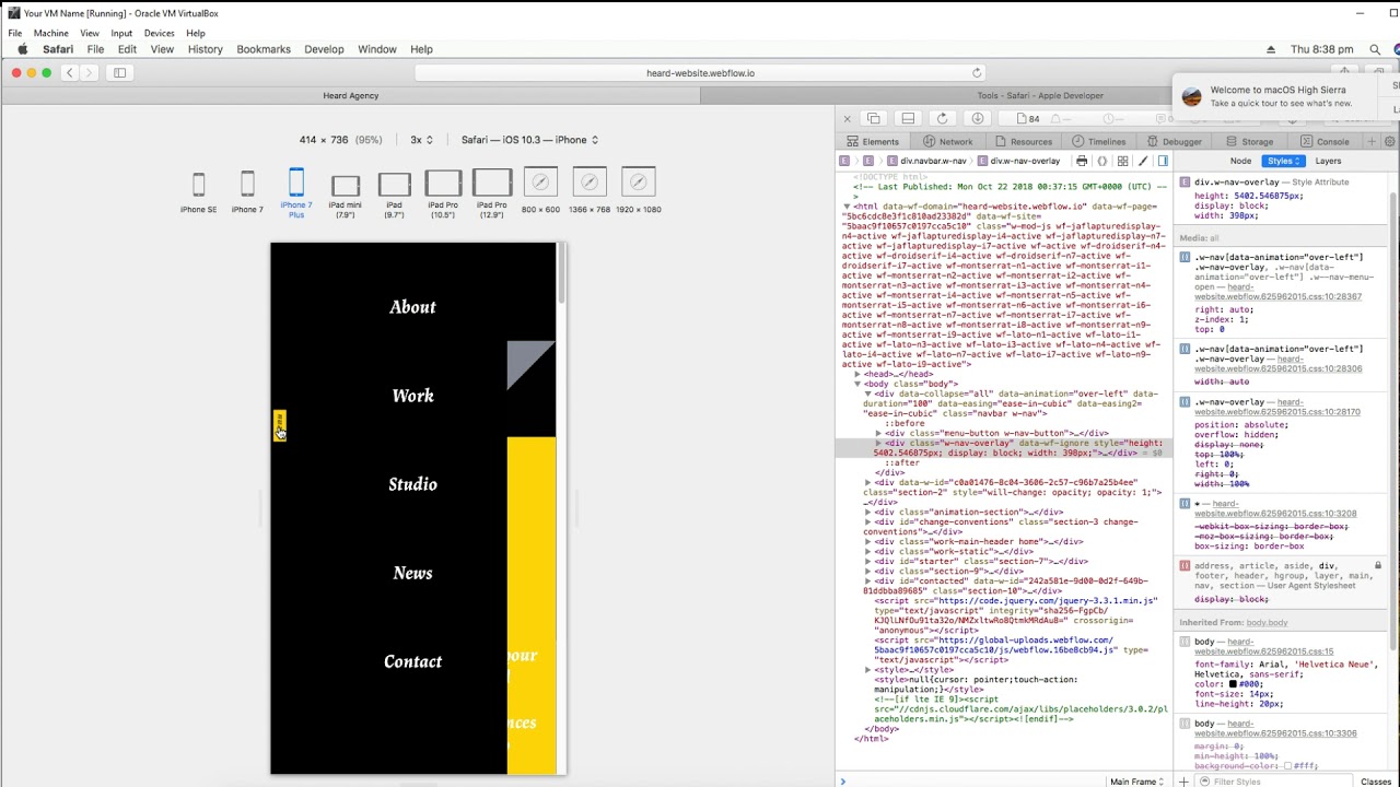
However in safari (ios) and in an inspector inside safari (osx) the menu is often cut off not taking the full width of the screen, and occasionally other elements will appear above it, even though the menu should be the very top.
I have tried removing all the custom code I had in there. Doesn’t fix it.
I also noticed that the javascript that controls the menu if giving a specific width, which happens to be where its cut off.
It looks like on safari, it’s just not rendering the w-nav-overlay section at all.
I have managed to “Fix” it by entering the following into custom code.
.w-nav-overlay {
overflow:visible!important;
}
But this seems like a super dodgy way of going about it.
Here is my site Read-Only: *https://preview.webflow.com/preview/heard-website?utm_source=heard-website&preview=e28130da193b55bc7c77ed727743c59f

