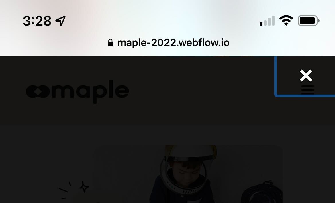
On iOS Safari the lightbox close button has what looks like a focus state (Blue Box) around the close button. Is there a way to remove this?
Hi Joel! Please provide a read-only link to your Webflow project so we can take a look. Instructions are here. Thanks!
Did you find a solution for this, Joel? I’m having the same issue.
I’m having the same issue (lightbox close button has what looks like a focus state (Blue Box) around the close button) on mobile, Chris. Can you help? Thanks!
Hi Sav,
In the custom code section of your project settings, can you place the following code for me in the Footer Code section?
<style type="text/css">
.w-lightbox-close {
outline: 0px !important;
}
</style>
I’ve tested this on another project after reproducing the issue and it seemed to take care of it. Let me know, please! Thank you!
3 Likes
This worked like a charm, Chris. Thank you!
I was wondering if you could also help me with another issue. I have an image of my book in a carousel. It looks amazing (big and bold) on desktop, but on mobile it is smaller. I have tried changing the mobile image, but that automatically changes the desktop image which is not something I want. I have another image (book cover vs. the book and back cover as shown on the desktop) that I could just use for the mobile version, but I just can’t seem to get it to work.
Please bear with me as I am just beginning with Webflow, so if you can record a quick Loom video I would appreciate it.
Thank you,
Savio
Sure, no problem! This is solved pretty easily just using the display mode property on different breakpoints.
1 Like
Thank you very much, Chris. That was a great video explanation and it worked like a charm!
If you don’t mind, I just have one other quick question. On the desktop break point, I have a Horizontal scroll feature with that beautiful large book graphic however, as you scroll down there is a significant amount of blank space before you see the Featured In section. I would like the transition quick, but can’t seem to figure out how to do it. A video would be great.
Thank you,
Savio
Hi Sav. Where I’m seeing a ton of blank space, it’s actually above the book graphic. The featured section is immediately below. Is this what you mean?
Apologies for the confusion, Chris. I included a video below of what I meant.
Thanks for this! Your Horizontal Scroll element is currently set to a height of 300vh, which means that this will size itself to 300% as tall as the browser window. If you reduce this (I would expect to no less than 100vh so that section is still 'full screen), you retain your effect on the book cover without empty space while scrolling.
Thanks for this tip, Chris. It worked! Much appreciated.
1 Like