I’m really hoping someone can help me as I spent ages yesterday creating a new page on my site, and when I’ve come to add and link it to my existing menu bar, the design of the menu bar changes. So rather than sitting normally across the head of the page where it should look like this:
Also, one additional problem i’ve encountered, for some reason the mobile menu works perfectly on mobile upright, but when it switches to landscape the design completely changes.
On normal mobile it’s this, which is the default setting that came with the layout:
I’ve also noticed that the menu preview doesn’t always open. Sometimes it does, sometimes it doesn’t so I’m not sure if there is a glitch with Webflow of if I’ve missed an obvious setting.
Allright! Had a look and here’s what’s causing your problems. Go to your Start Page and do the following:
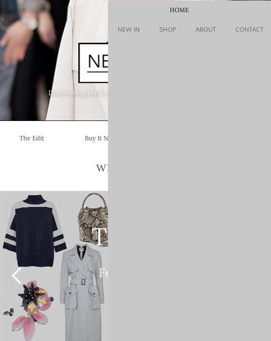
Your navigation, which is a symbol (good choice!) is located differently in your order of elements. For instance, on your start page it’s located in the “Hero Section” which normally is the correct way to place it in regards to what you are trying to achive with your nav bar. On your “New in” page, the navbar is located in a unstyled div below the “Hero section”.
Move the Navbar to be the first element inside your Hero Section. Always keep it first in order.
You have, to be honest, a little bit of a mess in your Hero section because you use multiple containers when it’s not really needed. I suggest to re-build that section like this:
Hero Section: set it to remove height (250px). Having that set to a pixel-set height will not make it responsive and cause your stuff to overlow when/if you add more stuff to the section.
Remove the top padding of 184px.
Place your “Discovering the new styles…” inside the same container as your logo (“test container”). Delete the old container it currently sits in…no need for that one.
Delete it’s top margin of -99px on “test container”.
Disable the symbol on your nav (not double click it but “releasing” it via the “Objects” panel.
Give your container inside your nav bar a class; Nav Container
Select the div called “Nav Menu” that contains your nav links. Remove the float:right.
Select nav link “Home”. Since you target this link to your first page, it’s going to have a “Current” class attached to it. When styling nav links, make sure you always do the fundamental styling on non-current classes. You’ll better of styling current classes later on if you just want to e.g highlight each current page. But not for general styling.
Remove the 126px width on the nav link “Home” and set it to display inline-block. I assume you want the same font for your neutral and current nav links, so on remove the font-styling on your current. Just click the “Aa” icon beside the font dropdown while holding your ALT-key on your keyboard.
Select “Nav menu” again and re-apply float right if you want your nav links to sit on the right. If you want it centered you have select text-alignment center down in the “Typography” panel.
9 . Give your Hero Section some bottom padding to let it breath a bit, like 20px.
10 . Select Nav Bar. Remove top margin (1px) and adjust top and bottom padding to 15px each.
Make your whole Hero Section a symbol and replace it on every page. Place it FIRST in order on all of that pages.
Bonus: Your nav links are hard to read when they are in black color. So either you
Increase boldness on your links
Add a slight transparent dark background on your “Nav bar” and use white color on your nav links.


