Hi there,
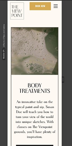
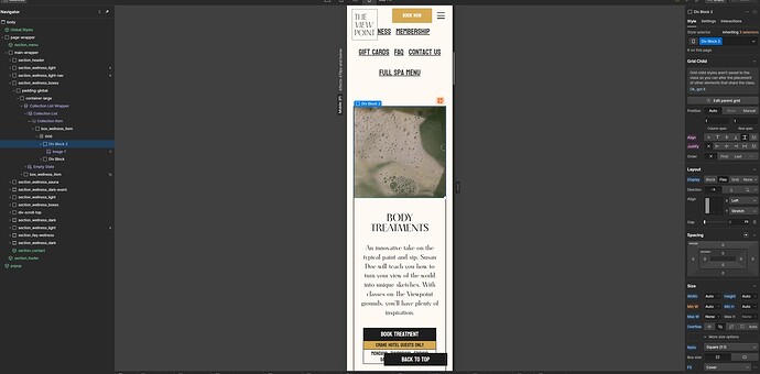
I’m working on a page where I want the images to display as 1:1 ratio on mobile. They look fine on the Webflow builder and preview, but when I view them on my iPhone the images are in a very narrow landscape frame - or do not display at all. The div below with text in is also vertically stretched - to the size that the image would be in 1:1 + the div’s own content. How can I fix this?
How it displays on the Webflow builder:
vs on my iPhone:
Thank you!
Here is my site Read-Only: [LINK][1]


