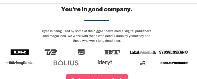
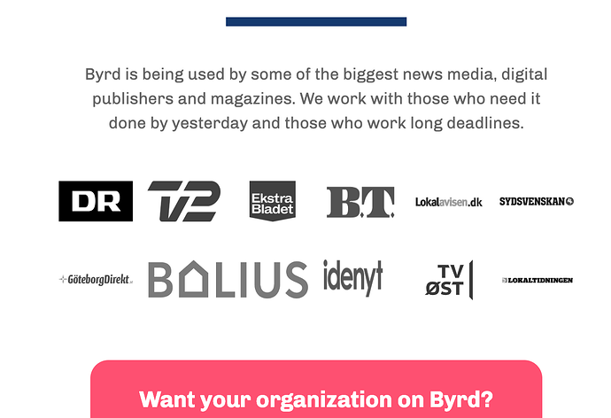
I’m following Webflow’s course on building a landing page with grid, but I’m having trouble with the brands wrapper grid. When I try to resize my browser window the images do not preserve their aspect ratio, but rather get squeezed.
Desktop:
Mobile:
My settings should be the same as in the course, so I don’t know what’s going on.
Here is my site Read-Only: LINK
(how to share your site Read-Only link)

