Image not shrinking with mobile and button issues


Mobile responsiveness troublesome again!

I have a few issues I’d love some assistance with:

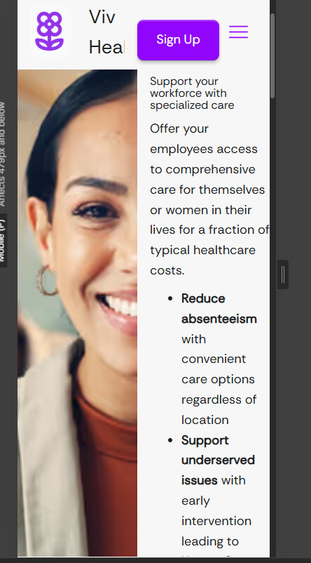
  1. Mobile view cuts off the image. Doesn’t shrink even after I played around with heigh/width. Its flex.
  2. How can I center the “book a call” button in my div?
  3. Need buttons to auto-fit to the text in the button, and add space/padding around the text. I had that before I messed with styling. How can I do that? can I go back to the original selector on the button?

Here is my site Read-Only: [LINK][1]
[1] “Partner”: Webflow - Viv Health

Hey @milar55,

  1. Based on the layout, I believe you can modify the grid settings on mobile breakpoint to stack the image and content vertically via the below highlighted setting:

  2. You can set the property of the div block to flex and align its elements at the center as follows:

  3. Not sure, which buttons you are talking about. The button in the header and signup does seem okay on all breakpoints, if some button on the webpage does not follow the style you want, you could apply the same styling on it like you have on the book intro call button / signup button in that case.

Hope this helps.