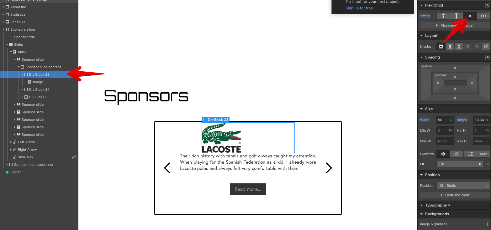
Hi everyone, I’m trying to make an image be responsive within a parent div by setting the div dimensions (33.33% of parent) and then setting the image to 100%, however I can’t get the image to stop increasing its parent div’s size.
This is so I can set a class and have different logos all have the same height within the slider in my Sponsors section on the home page.
I’ve tried changing percentages, adding wrappers, changing the positioning to Absolute, but absolutely nothing works. How can I make the image stick to the parent’s dimensions?!
The parent element of your elements with 33% height doesn’t have a defined height, so… the height of your 33% element can’t be calculated and is driven by the size of the image. If you give a height to the parent of those 3 elements, then you’ll see what you want because the browser will be able to calculate the sizes.
Also remove one div to put the image inside the 33% div. Also give the image 100% height so it fits in the div. And give the div flex child don’t shrink or grow.
All in all, dimensions aren’t magic, the browser cannot calculate them on the fly. Often, for advanced stuff, you need to cope for that with the help of javascript. javascript can calculate all those dimensions so other elements can dimension themselves accordingly.
Thanks for the explanation and the solution! I didn’t know that about how percentage based elements were calculated, so that was really useful to learn.