Hello,
I am trying to make a HTML Embedded Video on my site responsive for mobile. Could someone help me out with this? Class name is “HTML Embed 2”.
Thanks
Here is my site Read-Only: [LINK][1]
Hello,
I am trying to make a HTML Embedded Video on my site responsive for mobile. Could someone help me out with this? Class name is “HTML Embed 2”.
Thanks
Here is my site Read-Only: [LINK][1]
The video in question can be found on WHICH page and at WHAT part of that page?
Can be found on the Penn InTouch page in the last section 6, attached screenshot of video in question. Thanks
Your site has multiple width issues.
Image 45 in Section 2 is set to 120 vw which pushes all the other content left.

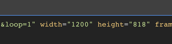
Then you are trying to fit a 1200 px wide video into a view that is very much narrower - Which, additionally, pushes all content left.
The Symbol Container 4 is also extra wide which is causing issues.
Start with the Desktop view and make all the content fit with in the view. Then do the same with all the remaining 3 views. Add a media query for other widths if you wish.
Sorry, I’m not following. All the content within my desktop view is being displayed properly, and the live site is responsive on all viewports currently.
The only problem I am having is trying to resize the HTML video embed I referred to so it can be responsive (and scale down) on mobile.
hi @oswidan here short video how you can fix your issue. Feel free to download it for later reference as I will delete it later when cleaning my Cloud storage.
Thank you so much Stan!! It worked perfectly.
I am trying to follow the same steps for the mobile video right below it to make that responsive as well, but its not working as expected. Is there another step for that one? Think it has to do with my parent div, Div block 35, being flex position… but I am not sure how to get around.
Thanks again!!
hi @oswidan I had a look into you project again and you still have on your mobile video fixed values. Anyway, your issue is related to div 35 because it is a flex child it will automatically shrink when position absolute is set on embed (please find some articles or videos about positioning ). You have to specify how element (flex child) will behave in flex. You can set grow when possible or set exact amount of space that flex child should occupy. Once you will set this behaviour all will start work. Be aware that you have to play with these values on each viewport if needed. There are great videos on YT for free to learn how flex works. 
THANK YOU SO MUCH. Had to play around with the align on the mobile breakpoint for it to display, but it works now. Thanks again man, you’re a hero
Glad to help @oswidan if you r issue doesn’t persist feel free to close your issue as solved
Thank you
This topic was automatically closed 24 hours after the last reply. New replies are no longer allowed.


