Grid Responsiveness

Hello,

Wondering if what I want to do is even possible?

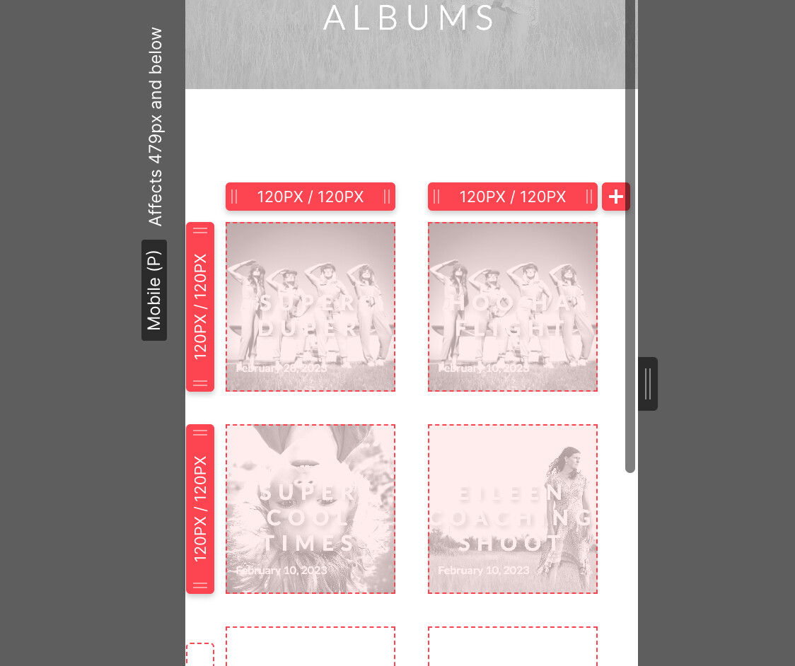
I’ve created a grid on my ‘Albums’ page that is a CMS collection. I have made the grid responsive however I wanted the mobile view to have 2 columns of square 1:1 centered tiles - this I have accomplished. That said, when I go to add a new album to the CMS collection, it does not auto-generate the rows to the exact size I made it (120px x 120px) in the grid in the mobile view. It defaults to 200px. It works well in every other view, but not mobile.

Wondering if it’s possible to have the mobile grid auto-populate and keep to the square size when a new item (album) is created.

Thanks in advance for your help.


Here is my site Read-Only: Webflow - Diana Bernier Photography

Hi @db2022 I think that’s possible.

Grids are super powerful, but I also find them to be one of the most complex areas of Webflow.

I don’t believe I 100% nailed it, but with a small bit of effort I’m fairly close to what you’re asking.

One of the things I notice is your “fr” (fractional) units. Their purpose is to auto-calculate things for you, you don’t want that.

Instead try setting your min/max to your hard coded 120px, and make sure “auto-fit” is unchecked.

Before:

After:

Before:

After:

Results:

I think this is what you’re after?

Also, I’d suggest setting your min/max on the image sizes for both width and height:

Hope that helps!

Sorry @ChrisDrit you have been faster :crazy_face: I have a slightly simpler solution.

1 Like

Don’t be sorry! Your solution rocks! Happy you posted it :smile:

1 Like

Amazing!!! Thanks to both of you (@ChrisDrit and @Stan)! I’m teaching myself and am absolutely addicted to Webflow and am so appreciative of the help that I receive on this forum.

All the best,
Diana

2 Likes