Grid 2.0 Glitch on Different Breakpoints?
Hello!
I’m playing with a new website layout and keep running into this bizarre problem.
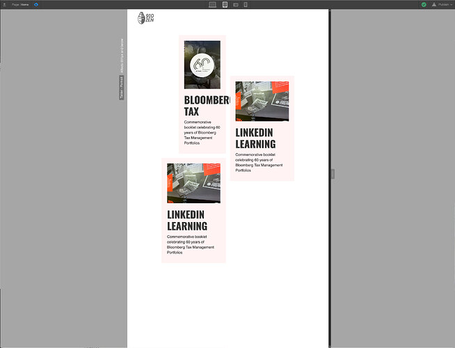
I usually just assume I’ve set something wrong (and perhaps I have), but when I view my grid (in the Webflow Designer) on different breakpoints, the Grid appears to go off the screen to the right, which makes it very difficult to make adjustments on various breakpoints since some are literally unreachable.
The other odd thing is when you view the site as “live”, everything appears to behave fine and NOT go off the screen, so… I’m not quite sure what’s happening.
Please note that in “Design view” the visible grid on:
Desktop: 12 columns wide
Tablet: 8.5 columns wide (3.5 cut off)
Phone Landscape: 6.5 (5.5 cut off)
Phone Vertical: 3.5 (8.5 cut off)
Also please note, that the images are loading a bit out of sequence. Most of the “grid on” screenshots are the 3 bottom graphics.
I’m attaching screen shots to illustrate this, and I also have my “Read-Only” version below as well.
Here is my site Read-Only: https://preview.webflow.com/preview/910zen-2019-a2?utm_source=910zen-2019-a2&preview=64e085c92a4617ffa1870f75e3bfa53e


