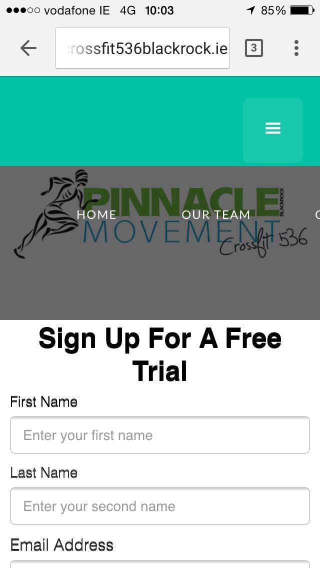
Just looking for some help with the mobile menu for this website, when I click it on a mobile, the menu isn’t filling the mobile screen, its going to the right rather than straight down to see all the pages, any ideas?
select the mobile breakpoint, the menu item, the settings tab and click open menu
select the menu container and instead of 900 something pixels, enter 100%
select the second menu item (not HOME), set the width to 100% and 0 for margin left
From there, it’s a bit better. And do that also for the other breakpoints. (tablet, mobile horiz).
The reason you select the second item to style menu items is because the first one has an extra CURRENT class so if youtyle this one it’s only going to affct itself.
Remember,n when you set a property for an element, you set it for the current breakpoint and for the breakpoints UNDER it. Hierarchy goes down, see what I mean?