Having issues with my dropdown menu, the dropdown box is getting cut off, and I cant figure out why. It is working perfectly on mobile and the minimised responsive design, but for some reason on desktop it displays as it does in the image below. Any help would be wonderfully appreciated.
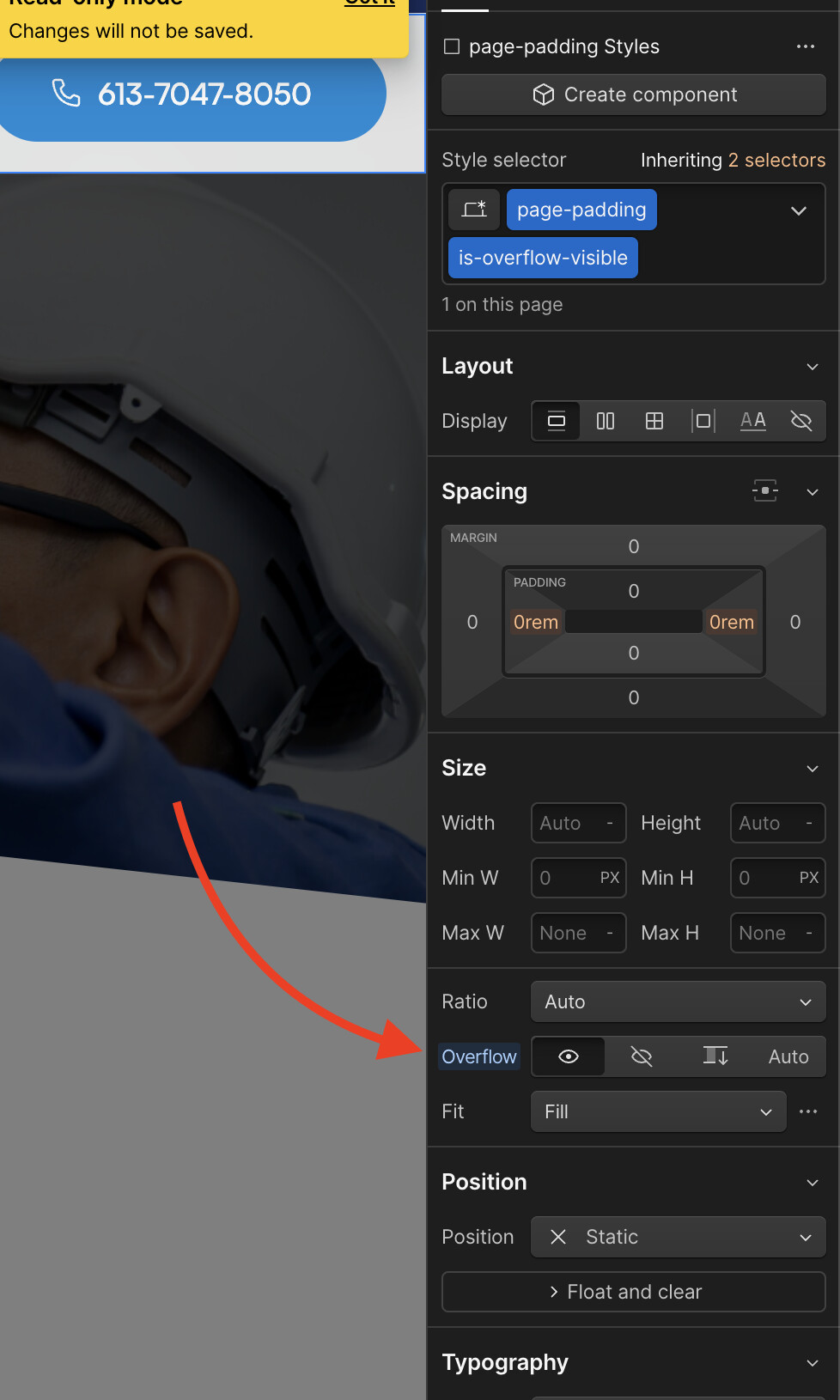
The issue you are facing is due to the fact that overflow is set to hidden on your .page-padding element.
To fix the issue, i would advise adding a combo class of .is-padding-visible or something of that nature to the .page-padding element inside your nav component. Then, set overflow to visible on that class. See the attached screenshot:
