When your using that Javascript, it based on a separate open and close button. In this case the hamburger menu is the open and close button. So instead of “click” state it should be something else?
I’m going to add that I’d like to know a solve for this as well. I made a button that opens an overlay menu (100 vh) on mobile, but on IOS the bottom chrome buttons appear when the menu is first opened, if the user engages with the overlay menu, the chrome buttons go away (good) but the site is visible and scrollable where the chrome buttons were (bad). The scrollable site only appears briefly, but it looks like a bug.
Add height: 100% in your body(All Pages) inside Webflow Designer.
Thats all! And the cool thing is that you don’t need to change anything in the code.
REQUIREMENTS:
This requires that you use the navbar element, Webflow gives you.
Nav Menu has to fill the screen.(100vh) If the user clicks out of the menu, it will collapse and the scroll will still be disabled.
*REMEMBER to change body(All Pages), height: 100%.
Happy designing
-David
EDIT 1: IOS Safari does not acknowledge overflow hidden when placed inside of <html> or <body>. I checked how Apple made their navbar not scroll at Apple.com, but it looks like they do just, what the afore mentioned article states doesn’t work. Testing showed that only applying overflow: hidden to the <body> tag, would not work. But applying overflow: hidden to both <html> and <body>, solved the issue. The only thing now is elastic scroll, being a bit ugly.
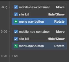
When I first came in contact, without know js. I wrapped everything from head under my header to the footer in a plane div; classed named, .site-kill. Added an interaction of show/hide to the .site-kill wrapper.
My collapsed file structure
Body
Header
Site-kill
Section
Section
Section
Footer!
All the solutions I found were multistep, javascript with mods.
One of the reasons I was doing this is, I wanted to keep the same button for open and close and I didn’t want to have to rely on I think it was webflow’s pre-made navbar.
I feel there would be some official update to this, unless I missed and I’d feel retarded, but things got complicated when lining things up and having nav shrinking on scroll.
Hope this helps some, disclaimer… If you need a transparent nav background, this obv won’t work. You could put a bg on nav container or on the body and keep your ‘site-kill’ wrapper white.
Hello all,
How can i disable mobile menu click after collapsed it? In version desktop is ok,but in version mobile,even i close menu the click function is active in background of it.
My mobile menu it was one page menu and i modify this to multiple pages.
Can anyone help me please?