Am I wasting time making sure my sites are responsive below 320px width? I find myself compromising in a few areas to make sure my sites look fine below this width when in reality it’s probably an insignificant amount of people that actually still read on these screens.
What is common wisdom around this? No need to bother?
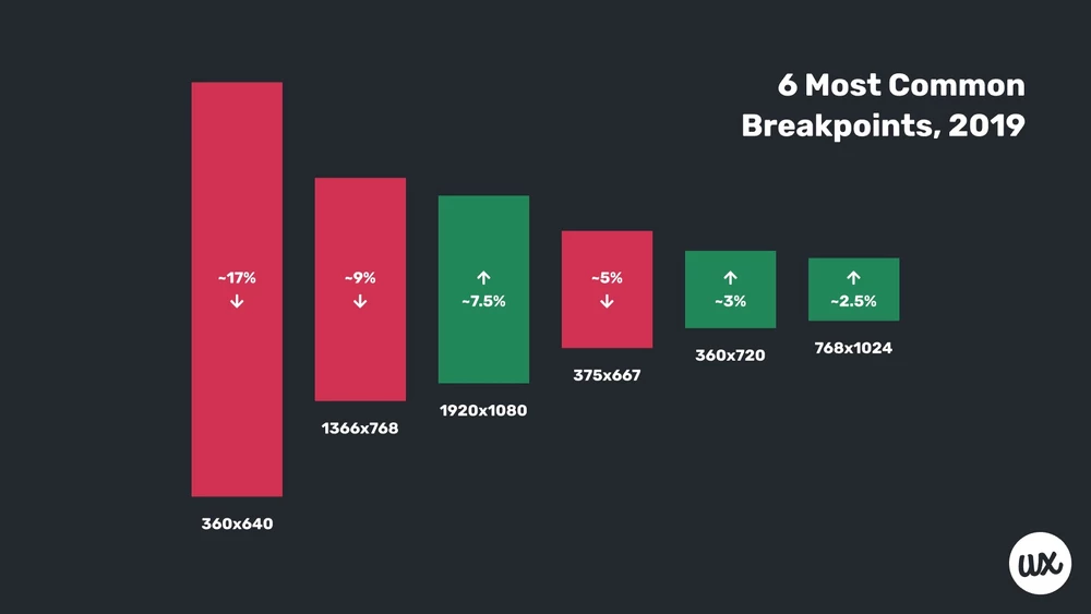
Mobile devices with less than 320 pixels are not very common.
Also here is a list with all mobile device screen sizes: screensiz.es
Personally, I would not focus on websites below 320 pixels, because I also think it’s too small to read and I wonder if people using that kind of mobile phone will update their phone regularly so browser support will be low too for new features like grid (my opinion).