Hello!
I’m having issues with some columns, that are especially causing trouble in responsive layouts for mobile. Basically they don’t line up as they should, and in mobile view it becomes a big hot mess! I have checked and double checked all containers and columns to see whether there are any set widths or margins that could potentially be causing trouble, but I have found nothing!
This is how it looks in Desktop (and how I want it to look)

When I change to mobile - it doesn’t line up anymore!
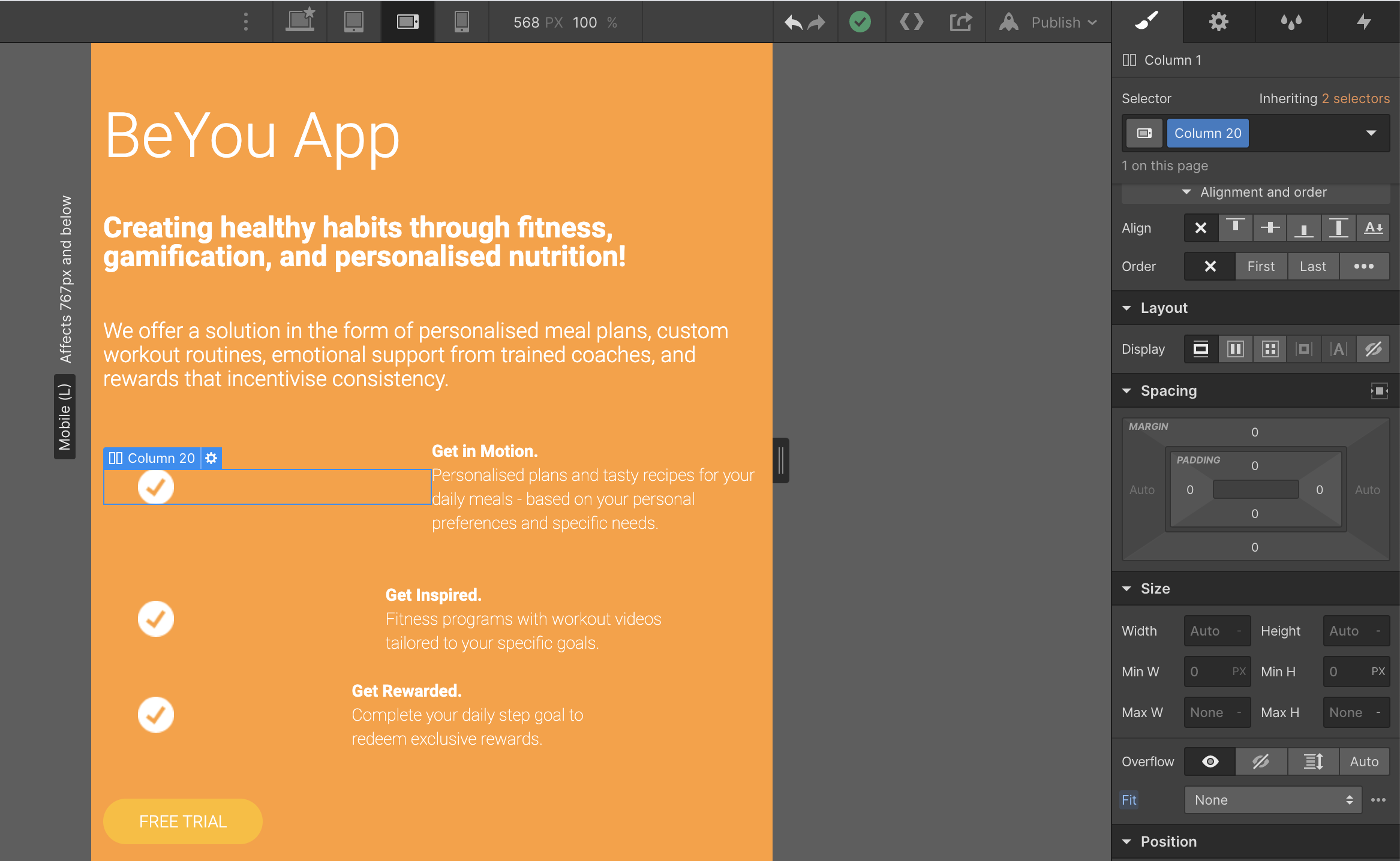
I’m also wondering why I can’t seem to chnge the column widths? as you can see below I’m trying to change the proportions but they stay as 1:1


Really appreciate any help, advice and insights!!! Thank you 
Here is my site Read-Only: https://preview.webflow.com/preview/beyou-89283d?utm_medium=preview_link&utm_source=designer&utm_content=beyou-89283d&preview=58d58bb82baa2ed7ef0c82bb8f115c47&mode=preview