Hi there, I am new to webflow and have been working on my first project. I am having a problem with my hero section.
I created a section, made the background image of that section the one i wanted, added a nav and logo in the center of the section.
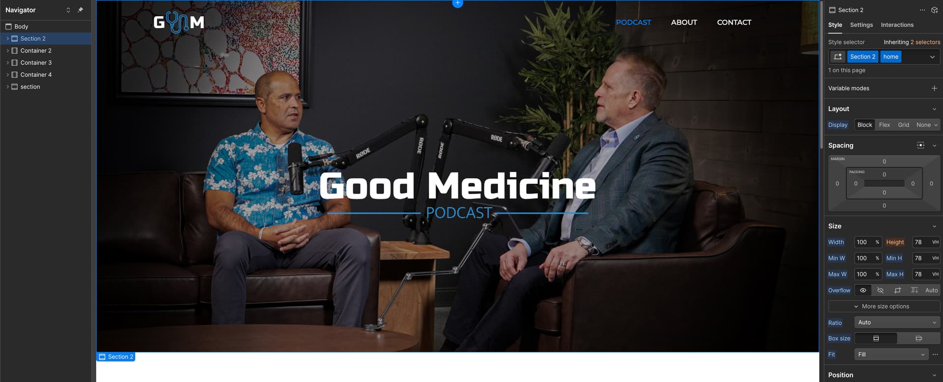
Everything looks great until I change screen sizes (different monitor sizes is as far as I’ve gone. Not too worried about learning mobile yet). The hero section is basically cropping my image based on the screen size. I want my image to be its original “crop” or lack there of on every screen size. I will add photos so you can see the “crop” i am talking about. Appreciate any help I can get!
Hi there,
To fix the background image cropping issue in your hero section, you can adjust the background image settings in the Style panel. Here’s what you can try:
The default “Cover” setting scales the image to fill the container, which may result in cropping. Switching to “Contain” will ensure the entire image remains visible while maintaining its aspect ratio. To change this:
- Select your hero section
- Open the Style panel
- Navigate to Backgrounds
- Under Size, change from “Cover” to “Contain”
Keep in mind that “Contain” may leave empty space on the sides or top/bottom of your container, depending on the image and container dimensions.
For more precise control, you can also adjust the background position using percentage values or focal points in the Background Position settings within the same panel.
Hopefully this helps! If you still need assistance, please reply here so somebody from the community can help.