The example is taken from the Quicksmart webflow template, which will work fine if you want a static table with set prices and edit rarely.
But a client requires a comprehensive comparison chart, where data is pulled from a collection list, and therefore some items may differ in length within the rows.
I wasn’t sure how best to set this up or if it’s even possible. I was initially thinking to do it with CSS Grid, but the static headings on the left column would be difficult to align with content from the collection list if it dynamically changes in height. And as far as Im aware the collection list will remain in one cell on the grid - I can’t separate the collection list content within cells?
Has anyone done a dynamic comparison chart before? struggling here
Hi, just having a look at this, I would say it’s possible.
It might be a little bit of a faff, but I would do it with static height row’s made up of individual DIVs, not the grid, as you cannot differentiate rows without having multiple collections (and there is performance issues there).
@JSW I tried your suggestion and it’s a bit of a hack, and guess it works ok for desktop. But for smaller screens the column with the row headings takes up unnecessary space, therefore we’re unable to fit 2 comparison items side by side, only 1.
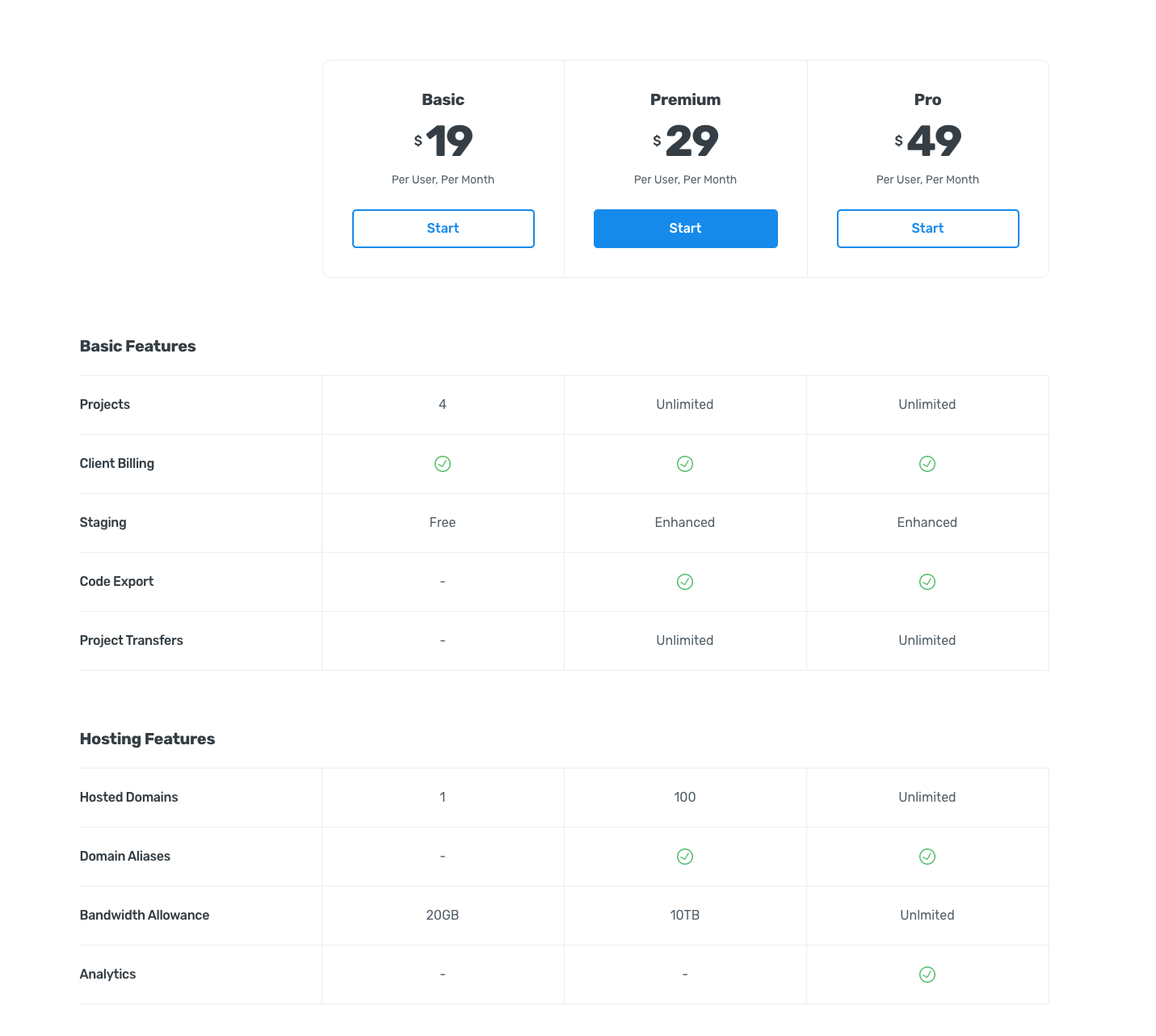
On this example https://vdeo.webflow.io/pricing-2 when viewed on smaller screens, the Row Headings (projects, client billing, staging etc) become centre aligned, which works well, but obviously I can’t do that if the column was a collection list, because theres no way to separate the collection list out / fitting elements between it etc.
@matthewpmunger@PixelGeek@vincent do you dudes have any idea of how I can achieve it, using collection lists? Does this require custom code?
@Esteban Hey
My approach would be to have a parent grid that contains the row labels and 3 collection lists. With manual grid positioning the elements such as row headers can overlap the three vertical collection lists. Since subgrid is not available yet in browsers (this is a perfect use case for it), you’ll need to explicitly define the row heights using px.
For the small mobile breakpoint, I’d switch from grid to tabs for the collection list columns. Looks like you’re on the right path. Hopefully this helps. Key is using manual position to overlap grid children when necessary. Happy designing!
How do I get around the issue of the text taking more row height and not aligning with the row heading on the left? If you resize the browser you’ll notice the ‘material overview’ columns start to wrap onto 2 or 3 lines and therefore can overlap.
I noticed you said use tabs for mobile, but what if some of the content (even on desktop) is more than 2 or 3 lines to begin with??
These settings will allow the left side to grow and shrink first instead of the comparison right columns. If there are still lines that are too long, I’d decrease the font size and/or increase the row height. Same answer for the mobile view to get consistent rows.

