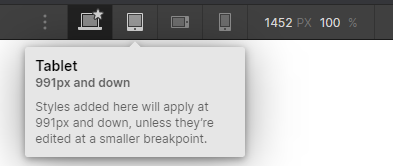
The way Webflow handles breakpoints is a bit differently than other methods - especially with the introduction of the new larger breakpoints. Instead of mobile first (designing for small screens first and adjusting as things get more breathing room) or desktop first (designing for large screens and adjusting as things run out of space), Webflow has a “base” breakpoint that cascades down to mobile devices and - if needed - up to large displays.
I’d strongly recommend you take a look at the Introduction to Breakpoints lesson in the Webflow University, but I’ll do my best to explain things a bit more concisely below.
Webflow & Breakpoints
When you start your project, you’re designing on the base breakpoint. Until you make any changes, this layout is the same for all screens. It may look like 1080px in the designer since this is the amount of space it has after the space occupied by the toolbars (you’ll see in my example below, I actually see the base breakpoint as 1452px), but it will get infinitely larger or squeeze as tightly as possible while following the rules you’ve established.
Adding Responsive-ness
When you’re ready to adjust your design for small screens, just click the adjacent breakpoint selection icon (in this case, tablet) and make changes as needed.

All of these changes cascade down (this is where the C in CSS - Cascading Style Sheet - comes from) to the lower breakpoints. This is essentially the desktop first method and was the way I learned to code websites before mobile devices were common place. By default, Webflow includes 3 smaller breakpoints that should be plenty to get your website looking good all the way down to mobile devices.
Larger Resolutions
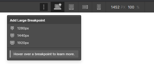
As I mentioned initially, Webflow recently introduced the ability to add up to three larger size breakpoints that can be enabled by clicking on the 3 dots to the left of your main breakpoint.

These work the same way as the included smaller ones, only they cascade the other way - up from your base breakpoint. This means that once you find a design doesn’t work for a larger display, just add a new breakpoint at the necessary resolution and make your adjustments. Keep in mind that it isn’t possible to remove them after they’ve been added, but adding new breakpoints doesn’t change the design until you override a style within that specific breakpoint.
Previewing Projects on Larger Displays
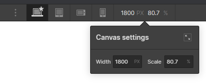
If you are working on a project and want to get an idea of how it responds to things on larger screens, just use the controls to the right of your mobile breakpoint. In my example below, I’m previewing my canvas at 1800px wide (348px wider than what’s shown be default) which is scaling things down to 80.7% of their actual size.

By default, if you create a larger breakpoint that’s at a higher resolution than your working monitor, it will scale your screen automatically to accommodate. This isn’t a perfect system by any means, but I’ve found that it does a good enough job simulating larger resolutions. If at any time you want to get back to your normal scale, just adjust the settings accordingly - keeping in mind it may switch your breakpoint to reflect the new resolution.
Your Situation
In your case, adding some higher resolution breakpoints can help the design adjust for larger displays however it’s important to remember that web design should never be done in absolute dimensions. I strongly recommend using relative dimensions (%, VW, VH, EMs, etc) along with either min or max width values in absolute dimesions instead as this will help your design remain fluid - even if it wasn’t necessarily designed to work within a specific resolution.
If you have a specific issue that you’re running into on your design, include a screenshot of your design reference if possible or explain the desired outcome and I’d be happy to walk you through the necessary changes.
