Hello,
I’m having trouble with my banner’s responsiveness.
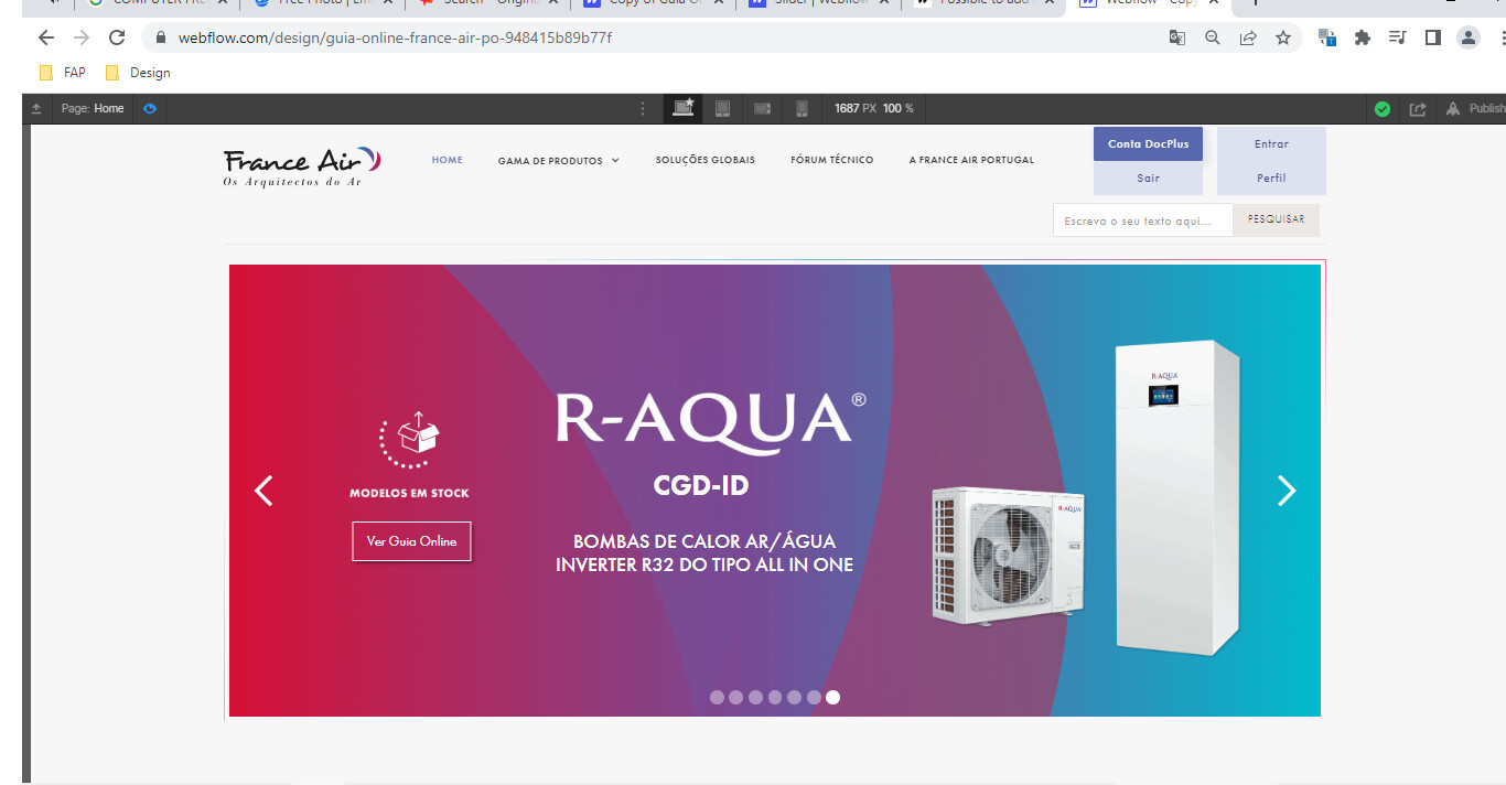
I created a banner using several images, texts and buttons as elements, so that it could be easier to style and adapt on every responsive aspect.
I fixed all the responsive modes (desktop, tablet, mobile landscape, and mobile portrait) and it seems that everything is all set until we drag the sides of the screen (to see how it would look like on a bigger desktop/tablet/mobile and everything just goes out of place). Some buttons get so out of place that they show up on other slides of the banner. How can I fix this? Maybe I’m doing something wrong when it comes to the position style (which is set to relative on all elements) or the spacing?
Here is my site Read-Only: Webflow - Copy Antiga Guia Online France Air Portugal
(how to share your site Read-Only link)