Hey gang,
I am super new to webflow and am still trying to figure a lot of it out. This is my mockup:

I’m trying to have a sorta background “grid” that my elements are all cleanly aligned with.
So, my first issue: the background is tiled from a single square SVG I have. At the moment, when I switch view sizes, the background moves around separate from my top elements, causing things to look haphazardly placed on the page:


What would be the best practices for setting these up to stay aligned with the background as I change viewports/devices?
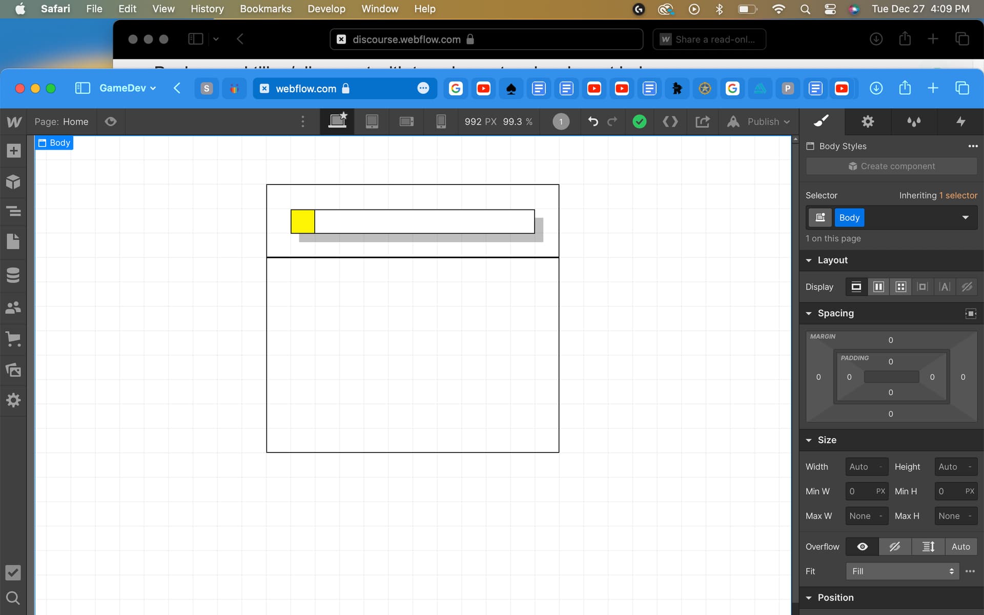
Next: you’ll see I’m trying to do a thin 1px wireframe look, but the horizontal borders where those two “boxed” elements butt-up to one another, that border is obviously 2px thick – should I just start the bottom one where the top one ends, essentially overlapping those 1px border lines over each other, or is there a smarter way to do this? Here’s a screenshot, slightly zoomed in:
Thanks for reading, I appreciate any feedback y’all can provide a total beginner like me!