When I look at the width of the pictures in the slider in webflow, it looks good. But when I look at it on the staging site (the one directly when you post from webflow), there seem to be other paddings / widths applaying.
No, i want them to have a padding left and right of 10px.
In Webflow the padding are right, but then on the staging site the padding at the end of the screen is always a few px bigger and I really have no idea why…
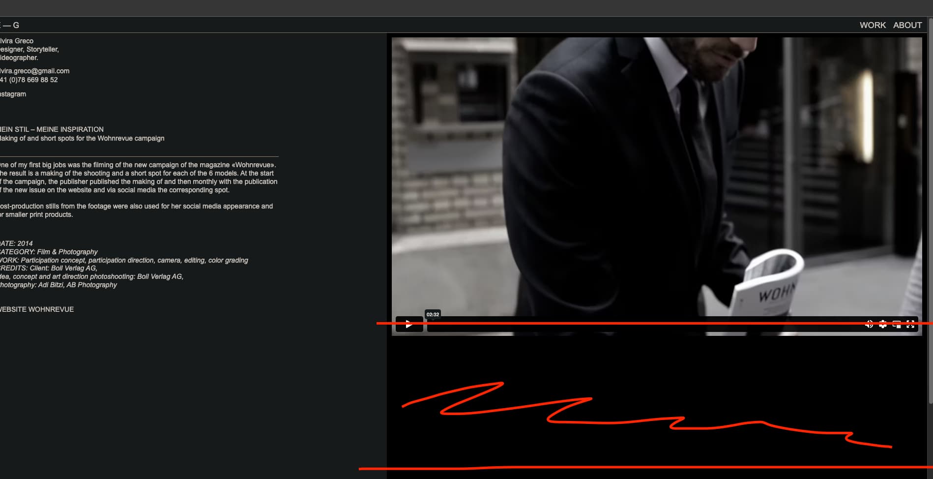
Are you referring to the space marked in red below? If not can you attach a screenshot of how you are seeing it and highlighting the area you do not want
No, i am talking about the padding settings left and right of the pictures. They should be on both sides 10 px, however, the side at the end of the browser always adds a few pixels and you can see that. Now I just noticed something very interesting: I can’t catch that with a screenshots, because even if you go exactly to the edge of the window, it still doesn’t capture exactly those pixels. And as soon as you take the window away from the very edge of the screen, it also shows right again. So I guess Desktops just add a few pixels at the edge and even with the restore css of Webflow this remains? How do you handle that?