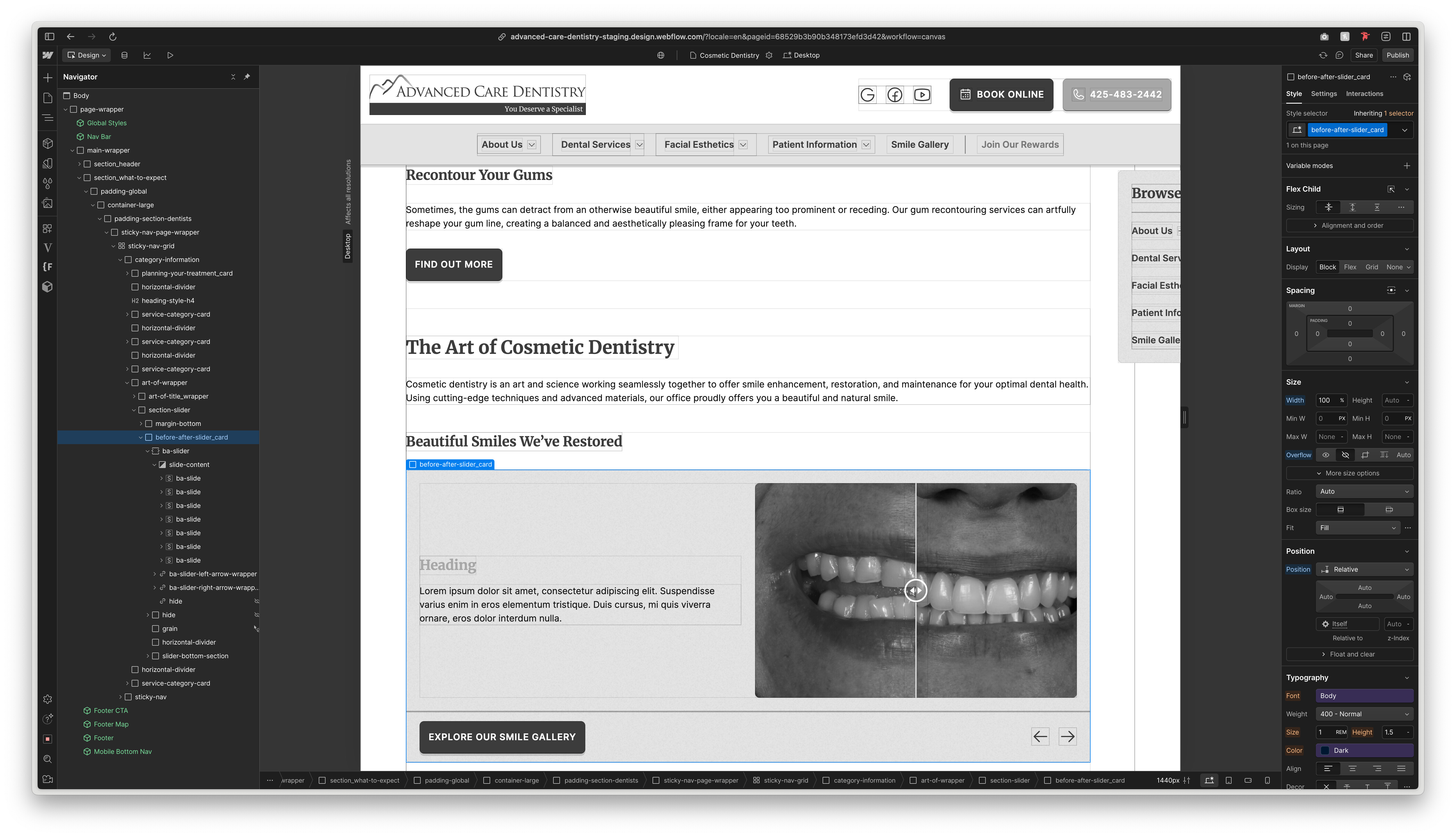
I have a slider named .ba-slider, within this is have a slide called .ba-slide.
When i begin duplicating the slides, once i get to about 4-5, the slides get wider and start breaking outside of its parent element and overflowing. I can’t for the life of me figure out why. Its all responsive to begin, but then just begins breaking when more slides are added.
It seems to be related to the view port because on a 1440px screen size its about 4-5 slides, but on tablet, mobile etc, its even down to adding 2-3 slides when things start breaking.
Ive tried making a clean slider with no content, but the same thing happens when adding a bunch of slides. Everything stays in its locked place and sizing up to a certain number of slides, but once i get past that number the slides get wider with every new slide i add.
Ignore the finsweet cms slider bit for now, thats for a later part of the build
To fix the overflow issues with your slider, follow these troubleshooting steps:
In the Style panel, locate the parent element of your .ba-slider
Set its Overflow property to “hidden” under Size settings
Enable X-ray mode in Canvas settings to visualize element boundaries
Check both parent and child elements - ensure they use percentage-based widths (100% or less) to prevent overflow
If you still see extra whitespace, hover your cursor along the right side while in Designer view to identify which specific elements are extending beyond their boundaries
Hopefully this helps! If you still need assistance, please reply here so somebody from the community can help.
For anyone reading, it simply seems that sliders just don’t support being in grids and for some reason this one didn’t like being side by side with my navigation bar using flex.
What I did to solve this is take my parent div (.category-information) which includes the page content, and take the sticky navbar (.sticky-nav) on the side out of the grid.
I added the relevant padding which equates to the size of my .sticky-nav so it pushed everything to the left leaving space on the right, then wrapping my .sticky-nav in a parent div with absolute positioning to the top right. Visually it looks identical and is responsive.
Simply seems sliders just don’t like being in grids