When I re-size an image on the phone or tablet view, it also changes the image on default mode. It works fine for text where any changes made on the phone view does not affect the default. I thought cascading only worked downstream. How can I re-size an image on phone view without affecting the default ?
You’re right, cascading only works downstream. I just tried that, and it works fine.
Can you share a public link?
Yes, that’s normal. Because you could want to give an image a size in %. You can try that, I use % often and it works well, in certain cases.
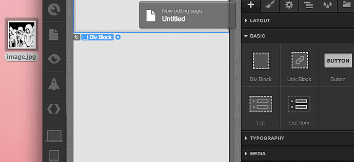
To fix your issue, put your image in a <div>, it will fill it. Then set the div dimensions for your devices views.
I have absolutely no coding knowledge and don’t quite know how to put my image in a div>.
Ok, it doesn’t require coding, just using webflow.
A <div> is a standard block element in HTML. It means “page division”, a portion of a page in other word. So a good reflex when you want to put something on a web site is to create a div first then put your thing in it. That way, you can set properties such as margins, padding, background etc to the div.
In Webflow, to place a div, click or drag the DIV element to the page. Then drag your image to the div.
In the animation below, I create a div block, put an image in it, select the div block, set it to 50% width, then vary the % value to show how the image sticks to the block.
Click on the image if the animation doesn’t start automatically.
Ahhhh, thank you so much Vincent. It all makes sense now. I was scaling my images instead and not the div blocks and made such a mess of things. Appreciate you clearing up all the confusion.
Yay, I can get back to designing now !
Great! (:
It’s never bad to avoid touching images dimensions when working on responsive or elastic sites.
