I have been searching the forums for information on responsive background images. I can see that a few people have made suggestions, but their posts are from 2016 or many years ago.
We use a static full-width image in the header for each service page. We overlay a filter over the image to darken it down with a blue tint and finish with an H1 heading and a small amount of text. Works great on a large-scale desktop, but performs poorly on mobile devices.
I apologise if I have overlooked a solution entirely. I’m hoping somebody can point me in the right direction to provide a modern solution/workaround?
Hey Nick — the “jump” usually happens when the container’s height is fixed or the background swaps at a breakpoint.
Quick fix pattern that’s very reliable:
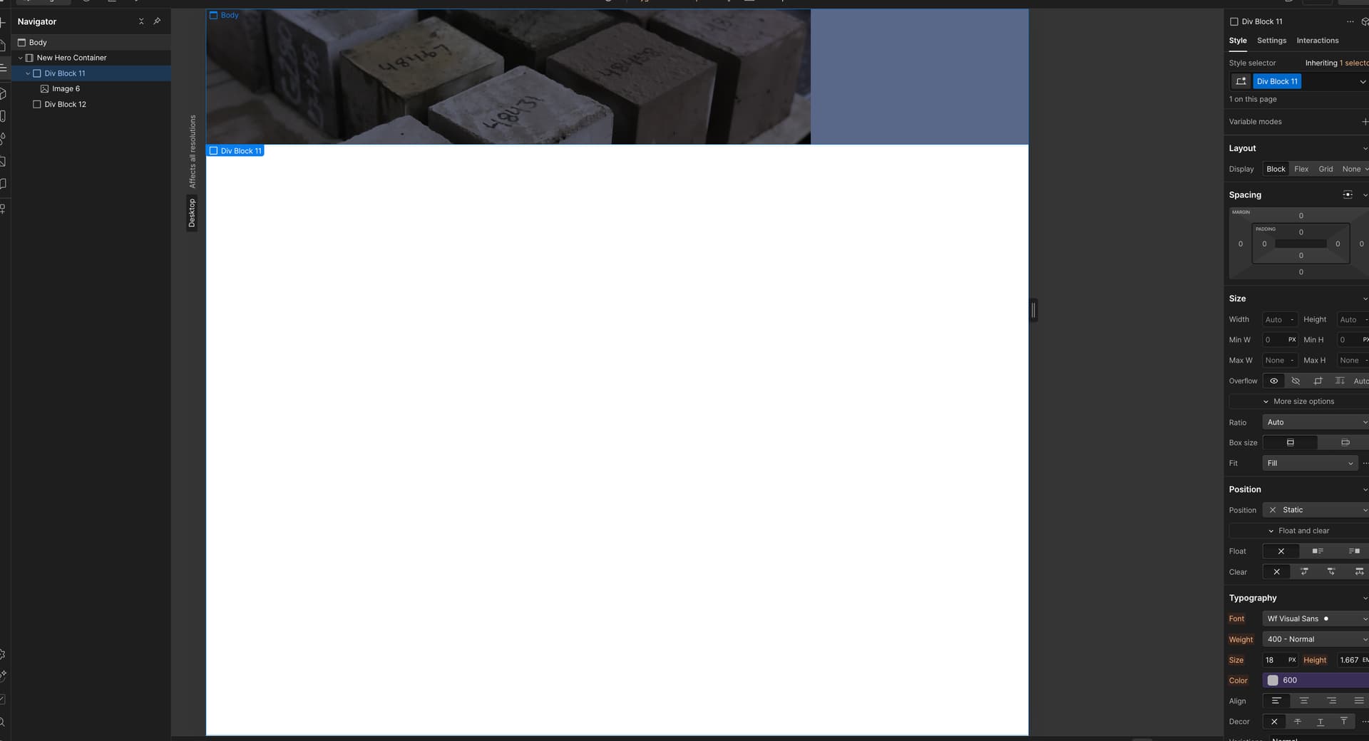
Make the wrapper position: relative.
Place an img inside, set position: absolute; inset: 0; width: 100%; height: 100%; object-fit: cover.
Keep text/content layered above with z-index.
If you can share the read-only link, I can point to the exact element and tweak the breakpoints for you.
Hi Nick, on the image, you have object-fit: contain instead of object-fit: cover. Also give the image 100% width and height to ensure it will stretch to fill the space.
Since your parent ( relative ) element is a Container element, you might have some odd CSS to contend with but you should be ok.
Remember that the Container height either needs to be set, or let the content dictate how tall the section will be.