I am using calendly to take bookings on my website.
It offers a HTML Inline imbed and it works perfectly on desktop but on mobile the scrolling mucks up! If you start scrolling on the booking bit it automatically puts a scrollbar on it and doesn’t work properly, even when you turn scrolling off?
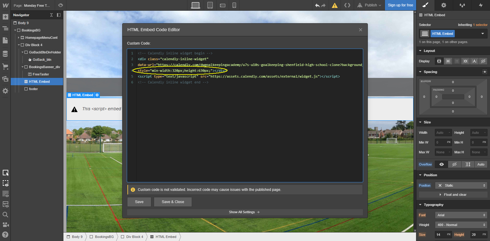
@samwhu30 that is odd. It’s hard to give advice on custom code since we can’t try, publish and see live using a read-only link. EDIT: I had another look at the code using the chrome inspect tool and it seems there’s a bit of padding that is added from within calendly. Removing that got rid of the scroll bar
this is the only bit of code I have from them so doesn’t look like its going to be possible to remove the padding! So frustrating, well found out though!
@samwhu30 yes, that’s the embed code. Sometimes, platforms allow you to add your own custom css. That would be the easiest way to override that padding. Otherwise, you’d add it inside this code but that can take a bit of experimentation.