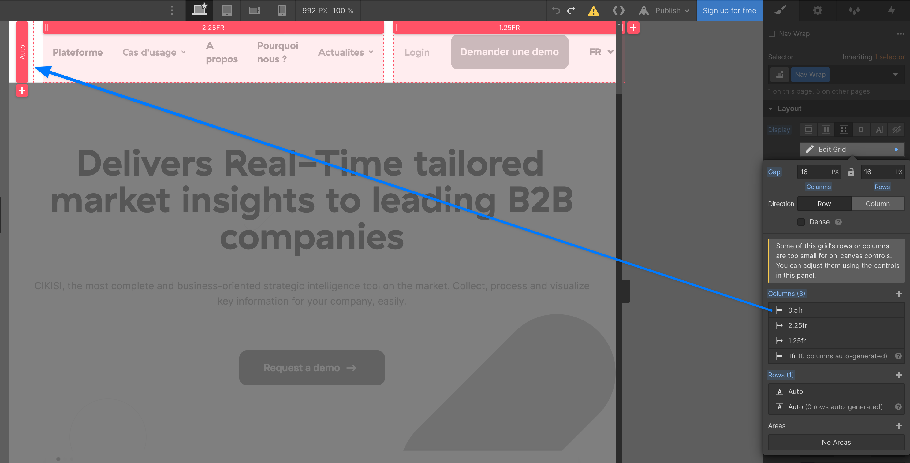
My navbar is not perfect while on Desktop - iPad pro breakpoint. The logo becomes small and invisible, and some elements goes outside the screen.
I tried to wrap the nav menu element but I’m not happy with the result.
What should I try to make my navbar good looking on iPad Pro breakpoint (smallest size on desktop).
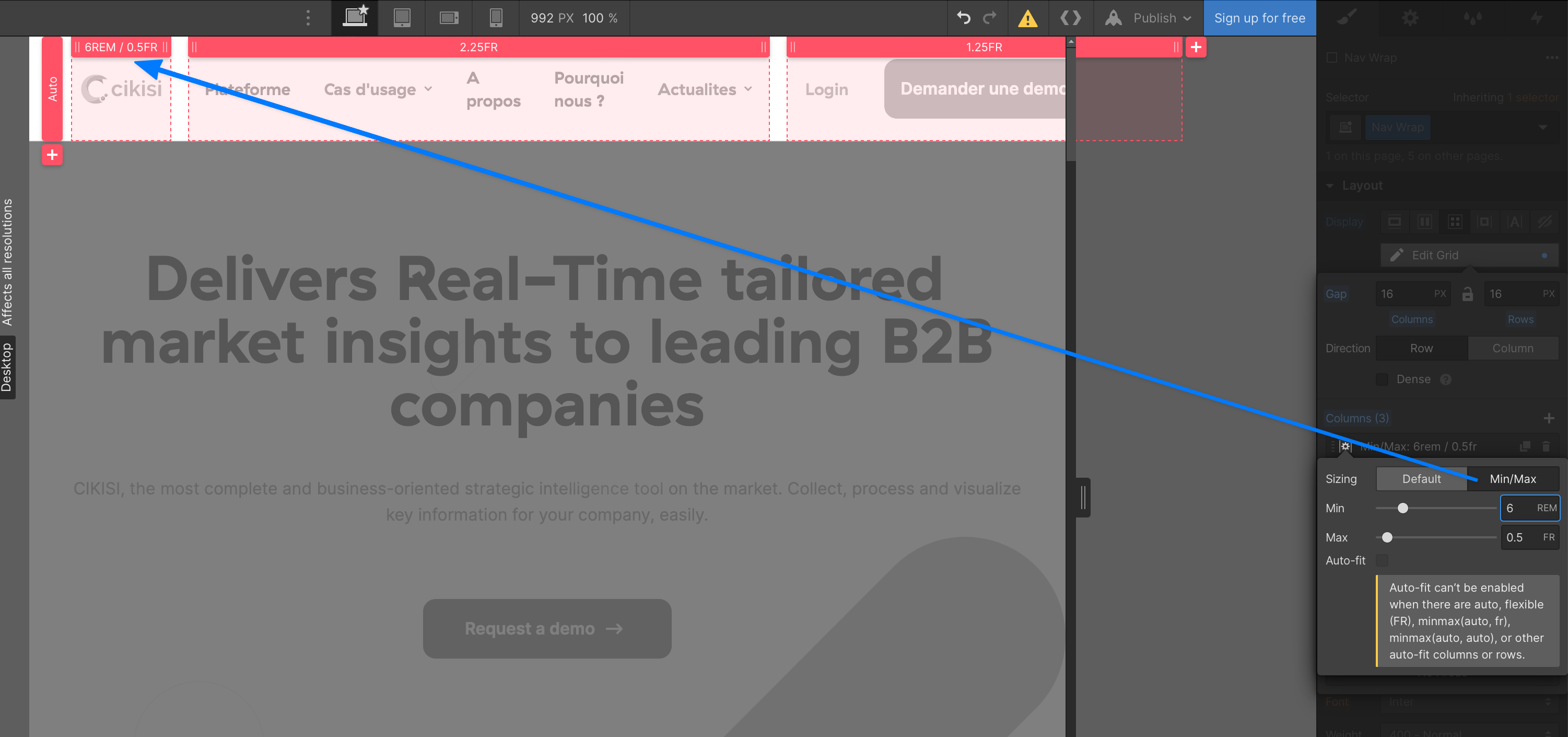
We can make the grid columns more responsive by using the min/max option. The max becomes the existing width of .5fr but now we can set a minimum size for this column. I randomly chose 6rem in this example but you can choose what best fits the brand and design.
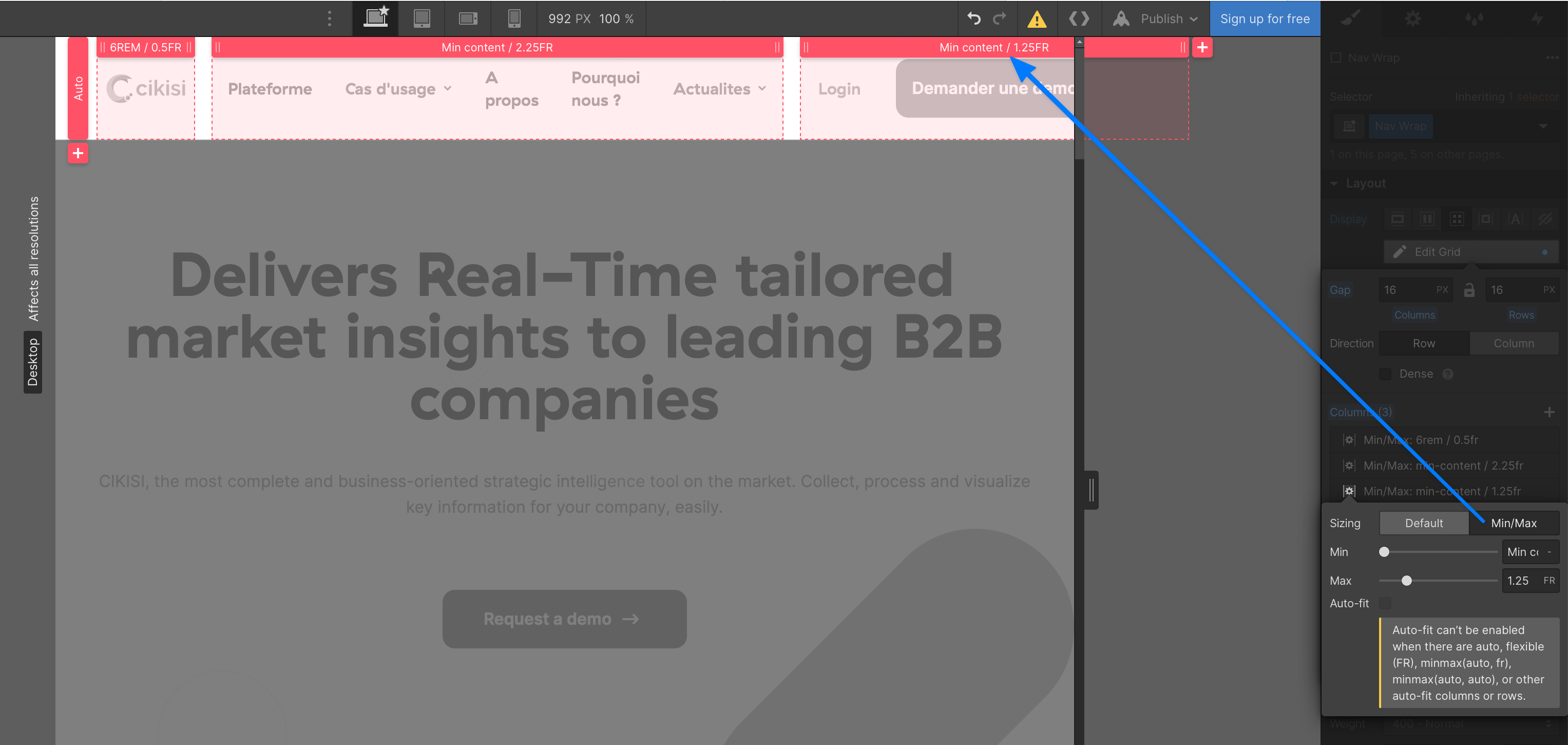
Now let’s apply a min/max to the other columns but this time use minimum content. Now for the final fix, you’ll need to adjust the size of the content within these columns to avoid content overflowing the grid or creating 2 lines of text.