I’m trying to create the similar Left Navbar Sliding animation that would push the content to the right when I’m in Mobile view, just like on many Mobile Apps nowdays.
I know I must use the Navbar menu type “Over left”, but it doesn’t push all my content along the way, instead it just slide the menu over it.
Anyone has a step-by-step tutorial for such a lovely user experience ?
I’m not going to provide a step by step, rather an general explanation of how this can be achieves. There are two approches.
Either you set a layout where the content and navbar sits one close to the other, while the layout is shifted to the left, hiding the navbar. Upon interaction, slide the layout to the right, to reveal the menu, hence pushing the content to the right.
The other way is to keep what you already have done, and add an interaction to the one sliding the menu in. This interaction will push the content container to the right, of the exact number of pixels of the width of the menu, in the same time span.
Ok so if I understood correclty, I think it’s less clumsy to go for the 2nd solution.
But still, I’ve spent a couple hours figuring out how to make it happen using the Navbar elements: do you think I can use this navbar widget, and still, preventing it from sliding above the content and making it push the content ?
Oh dear I’m puzzled. Maybe I need to get rid of the Navbar Widget and go custom at the end of the day…
I regret I don’t have free time to help you in depth with this. If I had to build this, and I did by thepast, I’d go for a custom built nav. It’s not so difficult to make, remember to give it the HTML tag “Nav” in the settings panel.
Try custom, try to come back with a sharing link when you have set the general layout and when you meet some difficulties, I’ll try to help you with that.
Alright I went ahead and tried out the 2nd technique as I said. But finally, I dropped the concept… Why?
Because I’m afraid the whole animation would “lag” on old phones, and make the experience tedious for some users.
Finally I decided to go for a left navbar that, in a stylish way, covers the whole screen. I like this concept as much as the push-content concept. I added a little X close icon on the top right of the menu so that users can close it easily.
Now the only issue I have is: how can I tell webflow that the height of the left menu must NOT be the height of the whole page content, but rather be the height of the device?
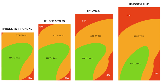
I haven’t said anything before but… I second that a thousand times. Dropdown menus on mobile is not a good concept or experience. Navigation on mobile should not be hidden, at all. Rather it should expand to a whole screen and be easy, evident, natural, app-like. Good decision. I often do a bottom bar with icons (go to 1001pneus.com and reduce the screen size to get to the mobile view). I call that the “Facebook approach” because it’s one of the big apps that went from a hidden side menu to a much more evident app-like bottom menu. Remember that everything you put on top of the screen will require 65% of the mobile users to use their second hand to tap, or to extend their thumb like they don’t want to. Honestly, I still don’t understand why in August 2015 so many apps and sites put navigation things on top of the screen or on the higher half of the screen, considering how big the smartphones are.
Anything in the orange zone already makes me yell at the design team:
I have 2 apps in dev, the two of them have a “lefty” mode that you can turn on in the settings and mirrors the UI. It’s not actually a matter of being a lefty or not, it’s just about how you use your device. I made my own study and often people don’t use the same hand considering the time of the day. Right hand in the metro, left hand in bed, on the street etc…
Height of the device = height of the browser viewport. So two solutions: body element to height:100% AND height of the menu to 100% too, or height of the menu to 100VH (type the “VH” unit by hand and good guy Webflow will take it.)
The initial scale meta you’re referring to only sets a “no-zoom” and not a lot more.
I’m not commenting on your JS because I’m a fraud in JS.
This post is so helpful, you should actually make it an article on your Blog. Really.
I’ve seen 1001pneus.com (Beautiful UI by the way) along with your research on nowdays Mobile Screen Size, and you made me realize why Facebook went back to the bottom-menu style. It makes sense.
Now I guess the perfect menu for this theory would be Path’s “Sunrays” bottom left nav: Prototype demos - Proto.io (look at the #2 demo on the first row)
About making the Height of the Nav-Menu = Browser/Device Viewport Height:
I tried setting Body: Height=100% and Nav-Menu: Height=100%, nothing changed
I also tried NaMenu: Height=100 VH : Webflow doesn’t take it. It puts back to Auto or 99%. (Correction : if you put 100vh without any space between the 100 and the VH, Webflow takes it). But still, nothing changed. I still have a scrollbar on the right of my left menu panel and it goes deep.
As the content in the page is very deep, then Wevflow extends the height of the Nav-Menu aswell - that’s so annoying. I really don’t want a 10 feet long left-navbar panel. I don’t have that much links! I just want it to fit the screen height.
PS1: I couldn’t post any link as for this project I’m under NDA. But I saw you understood quickly what I was up to.