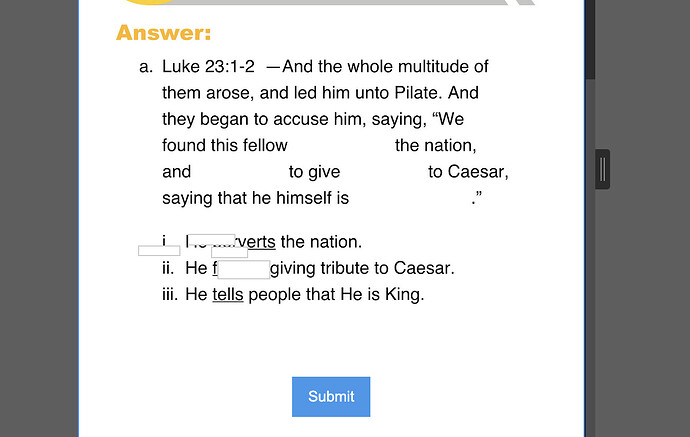
i am having an issue with mobile breakpoints. I am building a fill in the blank form where users will fill in the appropriate answer in each section, everything scales nicely except for mobile. When i resize the mobile screen size (change the px) my relative form input sections move all over the place. The only solution i have found is to set the max width to the minimum distance. which I would rather not do. Any advice appreciated.
Preview Link: Webflow - Bible Study Guides - Revelation of Love

