I’m trying to add three overlapping images, but the problem I’m having is making them responsive. Such that each image resizes proportionally with each other.
If you change the viewport width, at some point the overlapping images fall apart.
I’m trying to add three overlapping images, but the problem I’m having is making them responsive. Such that each image resizes proportionally with each other.
If you change the viewport width, at some point the overlapping images fall apart.
Hey Designor,
After having a quick look I think you issue is that your not applying any units to your ‘images’.
I would also suggest looking at break points:
With this info you will be able to get those squares responsive to the window size and looking great on all devices.
Good Luck 
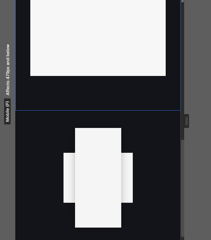
If I hard-code the size of each image for a given viewport, the images end up looking too small.
Let me give you another example.
I’ve added a 2nd section with a single image that resizes depending on the viewport width. And then created a 3rd section with the three images, but hard-coded the width of each image to make them fit the smallest viewport.
The problem width hard-coding the width, is that it’s not fully responsive. The 2nd image fills out the viewport, which is what I want, while the 3rd set of images don’t because their width is hard-coded.
I want the 3rd set of images to be responsive like the 2nd image.
Hey, sorry I have no understanding of hard coding etc. If my suggestions haven’t helped then I am of no more use, sorry.