Here is temporary access to the RO of my project.
https://preview.webflow.com/preview/wf-images?utm_source=wf-images&preview=1ecc078ff81f294434d7ff1a6e4a8cea&mode=preview
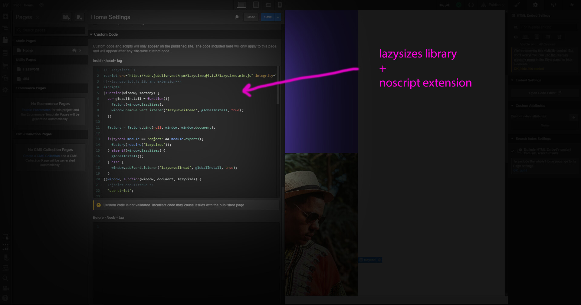
@anthonysalamin → Here is the Head Code
<script src="https://cdn.jsdelivr.net/npm/lazysizes@4.1.8/lazysizes.min.js" integrity="sha256-fTBo7ekO22pjfhP1rQs1prKEo4Iu8eVPODvm0oOL5Xc=" crossorigin="anonymous"></script>
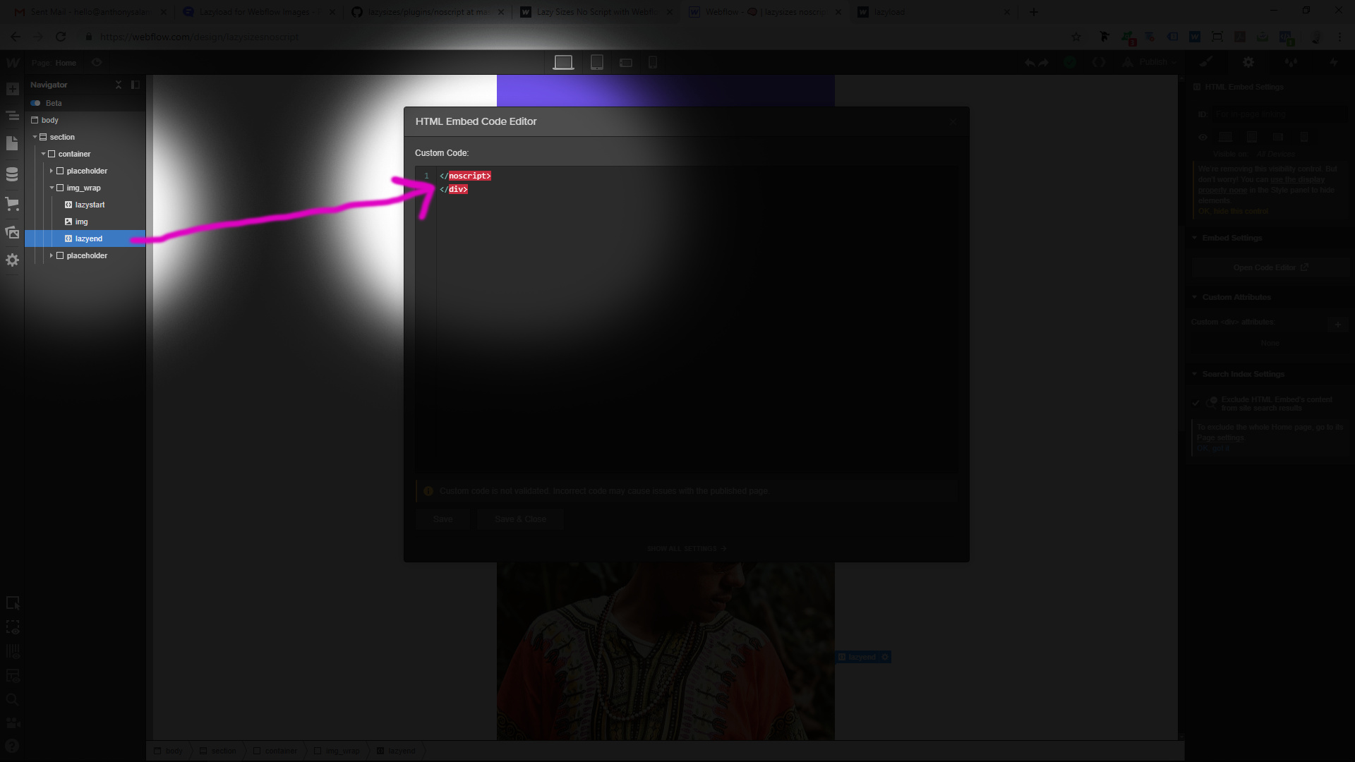
<!-- lazysizes noscript plugin load https://raw.githubusercontent.com/aFarkas/lazysizes/master/plugins/noscript/ls.noscript.min.js -->
<script>
/*! lazysizes - v4.1.8 */
!function(a,b){var c=function(){b(a.lazySizes),a.removeEventListener("lazyunveilread",c,!0)};b=b.bind(null,a,a.document),"object"==typeof module&&module.exports?b(require("lazysizes")):a.lazySizes?c():a.addEventListener("lazyunveilread",c,!0)}(window,function(a,b,c){"use strict";var d={nodeName:""},e=!!a.HTMLPictureElement&&"sizes"in b.createElement("img"),f=a.lazySizes&&c.cfg||a.lazySizesConfig,g=function(a){var b,f,g,h,i,j=a.target.querySelectorAll("img, iframe");for(b=0;b<j.length;b++)f=j[b].getAttribute("srcset")||"picture"==(j[b].parentNode||d).nodeName.toLowerCase(),!e&&f&&c.uP(j[b]),j[b].complete||!f&&!j[b].src||(a.detail.firesLoad=!0,h&&i||(i=0,h=function(b){i--,b&&!(i<1)||g||(g=!0,a.detail.firesLoad=!1,c.fire(a.target,"_lazyloaded",{},!1,!0)),b&&b.target&&(b.target.removeEventListener("load",h),b.target.removeEventListener("error",h))},setTimeout(h,3500)),i++,j[b].addEventListener("load",h),j[b].addEventListener("error",h))};f||(f={},a.lazySizesConfig=f),f.getNoscriptContent=function(a){return a.textContent||a.innerText},a.addEventListener("lazybeforeunveil",function(a){if(a.detail.instance==c&&!a.defaultPrevented&&null!=a.target.getAttribute("data-noscript")){var b=a.target.querySelector('noscript, script[type*="html"]')||{},d=f.getNoscriptContent(b);d&&(a.target.innerHTML=d,g(a))}})});
</script>
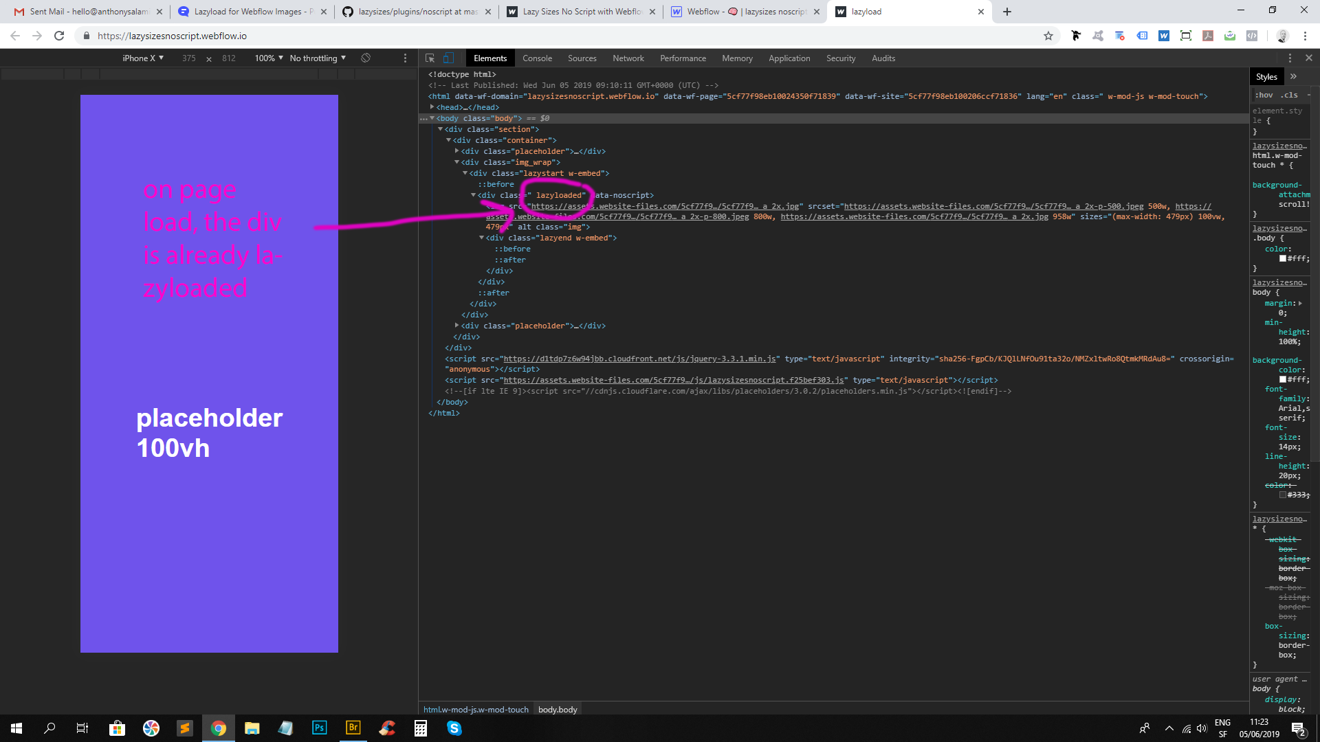
 (still not working)