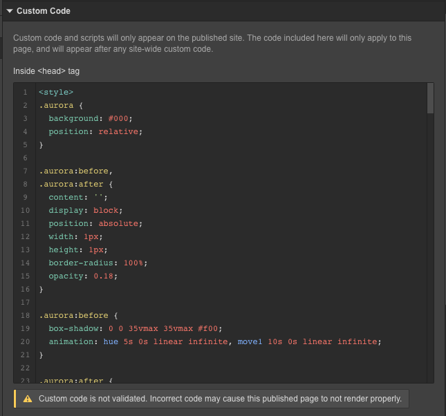
And basically it’s about how I can implement custom code from a Pen I found on CodePen into my Webflow site. I was able to get it working on Webflow through custom code to a certain degree, but it still wasn’t quite like what the preview on CodePen was showing.
I have made some adjustments to the code on that Pen, and have come up with this CSS:
// *** Magic starts HERE
diameter = 35vmax

    .aurora
	background #1b1b1b
	position relative
	&:before,
	&:after
		content ''
		display block
		position absolute
		width 1px
		height 1px
		border-radius 100%
		opacity .30
		// transform rotate(55deg)
	&:before
		box-shadow 0 0 diameter diameter #e82c72
		animation:
			hue 10s 0s linear infinite,
			move1 20s 0s linear infinite
	&:after
		box-shadow 0 0 diameter diameter #31c5f4
		animation:
			hue 10s 0s linear infinite,
			move2 20s 0s linear infinite

@keyframes move1
	0%
		top 0vh
		left 50vw
	25%
		left 0vw
	50%
		top 100vh
	75%
		left 100vw
	100%
		top 0vh
		left 50vw
@keyframes move2
	0%
		top 50vh
		left 100vw
	25%
		top 100vh
	50%
		left 0vw
	75%
		top 0vh
	100%
		top 50vh
		left 100vw
Now I’d like to know how I can implement this into Webflow with it working the exact same as it does on CodePen.
It works great with the original code from CodePen, however I made some changes to the code to make it only use two colors as opposed to a full rainbow cycle. You can paste this code into the Pen to see what I mean:
.aurora
	background #1b1b1b
	position relative
	&:before,
	&:after
		content ''
		display block
		position absolute
		width 1px
		height 1px
		border-radius 100%
		opacity .30
		// transform rotate(55deg)
	&:before
		box-shadow 0 0 diameter diameter #e82c72
		animation:
			hue 10s 0s linear infinite,
			move1 20s 0s linear infinite
	&:after
		box-shadow 0 0 diameter diameter #31c5f4
		animation:
			hue 10s 0s linear infinite,
			move2 20s 0s linear infinite

@keyframes move1
	0%
		top 0vh
		left 50vw
I tried pasting this code into the compiler and then put the code into Webflow, but when I publish the site, the effect doesn’t play.
Thanks @micahryanhtml and @samliew for all the help thus far.
Unfortunately, in your live site, it seems it still cycles through many different colors of the rainbow, however the effect I’m looking for only cycles through two colors.
For a better understanding, please paste this code into the Pen:
.aurora
	background #1b1b1b
	position relative
	&:before,
	&:after
		content ''
		display block
		position absolute
		width 1px
		height 1px
		border-radius 100%
		opacity .40
		// transform rotate(55deg)
	&:before
		box-shadow 0 0 diameter diameter #e82c72
		animation:
			hue 10s 0s linear infinite,
			move1 20s 0s linear infinite
	&:after
		box-shadow 0 0 diameter diameter #31c5f4
		animation:
			hue 10s 0s linear infinite,
			move2 20s 0s linear infinite

@keyframes move1
	0%
		top 0vh
		left 50vw
	25%
		left 0vw
	50%
		top 100vh
	75%
		left 100vw
	100%
		top 0vh
		left 50vw
@keyframes move2
	0%
		top 50vh
		left 100vw
	25%
		top 100vh
	50%
		left 0vw
	75%
		top 0vh
	100%
		top 50vh
		left 100vw
I have tried compiling the CSS in CodePen and then pasting the code into my site, but instead of two colors, it only shows one, as seen below: netweave.webflow.io
In regards to your question @samliew, I’m not sure if there needs to be a value there. The effect works without any issues on CodePen without having to add any values for the diameter diameter
Your live site seems to perfectly resemble the effect I’m looking for, however your latest preview link isn’t working anymore. I tried using the code in your previous preview link, but what I get is simply the blue color again.
