Hello everyone, newbie here ![]()
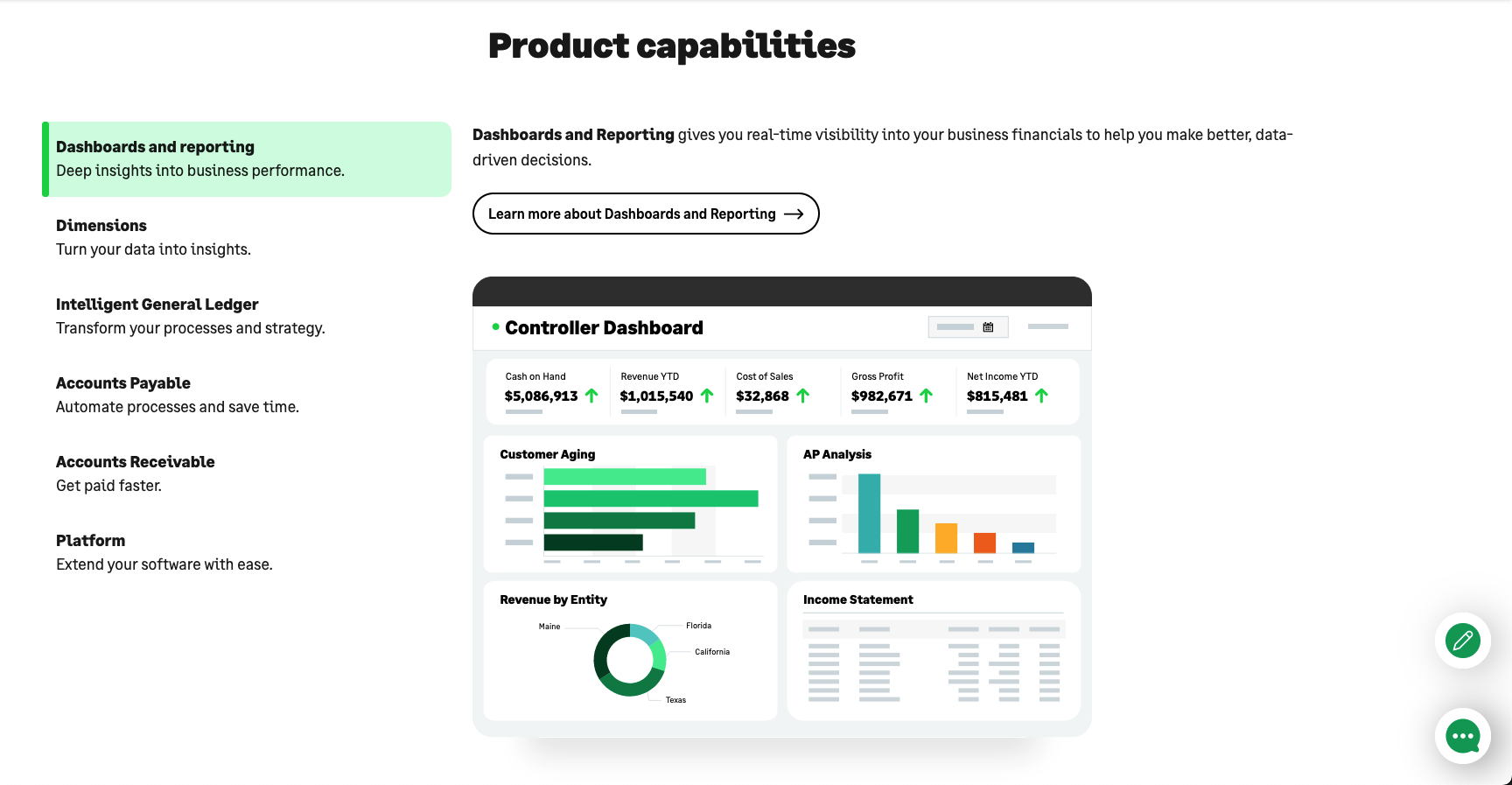
I’m trying to build a section with a feature comparison split screen layout but I can’t seem to find any help that addresses this specific (and very common) type of layout. I attached a couple of screenshots of examples from webflow.com and https://www.sage.com/en-gb/sage-business-cloud/intacct/
I’ve made the section and divided it into a grid with two columns: one for the features and one for the visuals. From this point on I have several questions:
-
Should the grid have as many rows as features? I watched this tutorial (https://www.youtube.com/watch?v=FUeTPMJHtrc) where the grid has only one row and the scrolling reveals the other features.
-
Is it possible to animate the feature scroll with webflow’s interactions or does it have to be custom code, like in the tutorial above. I also watched the same creators tutorial on achieving the same thing but without custom code(https://www.youtube.com/watch?v=FkvImc0l9zU&t=194s), but I can’t seem to understand how to extrapolate his method to what I’m trying to build here lol ?

**Also I don’t mind if it’s just clickable like the Sage example or clickable/timed like the Webflow example.
-
Should the features be part of a collection list and pull all the data from there (much like the tutorials above) or should it be individual text?
-
How can I add the highlight vertical colored line to each feature?
I’ll put the link to the page I’m working on, the section I want to apply this to is “¿cómo funciona?”
BONUS: I also need help trying to achieve a similar -but slightly different- interaction in the section above “Nuestras soluciones”, where I want the section to stick and as the user scrolls, it goes through the three different types of products/solutions and the image changes accordingly. (I followed the tutorial above for this but got stuck at the custom code ![]() )
)
Thanks for the help!!
Here is my site Read-Only: Webflow - LISTO.MX
(how to share your site Read-Only link)