Hi,
I have made a flexbox with 3 divs for a list of links in a modal nav. I would like to prepare this format for a CMS where the client may add enough links to make the column wrap onto two lines.
I don’t seem to be able to get flexbox to recognise the width of the wrapped links, is it possible to have 1 column grow and the others shrink if the content in one column wraps to two? Or is this something that needs custom code or JS?
http://jsd-sandbox.webflow.io/flex-fit-experiment
https://preview.webflow.com/preview/jsd-sandbox?utm_source=jsd-sandbox&preview=27d8886d509c29d42ae080a59775e209
Trying to achieve something that looks like this:
Here is my site Read-Only: LINK
(how to share your site Read-Only link)
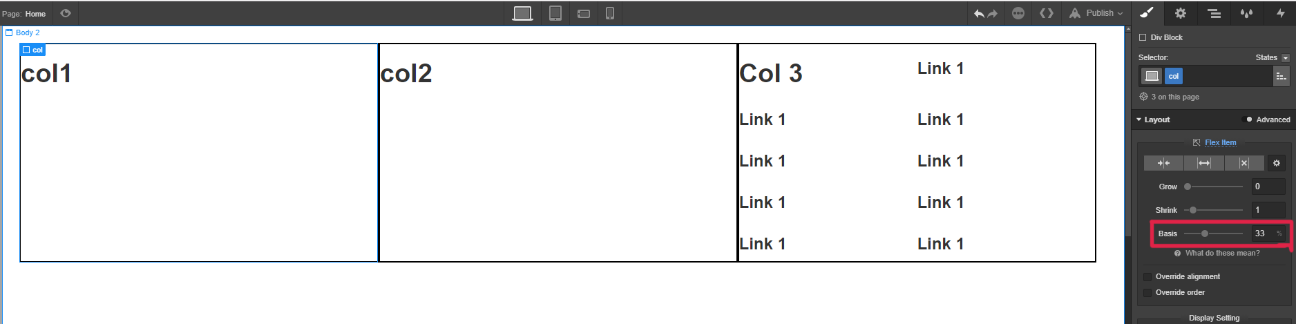
One way:
If you set the parent to display:flex;

And col 1/2/3 base basis to 33% you get this result:
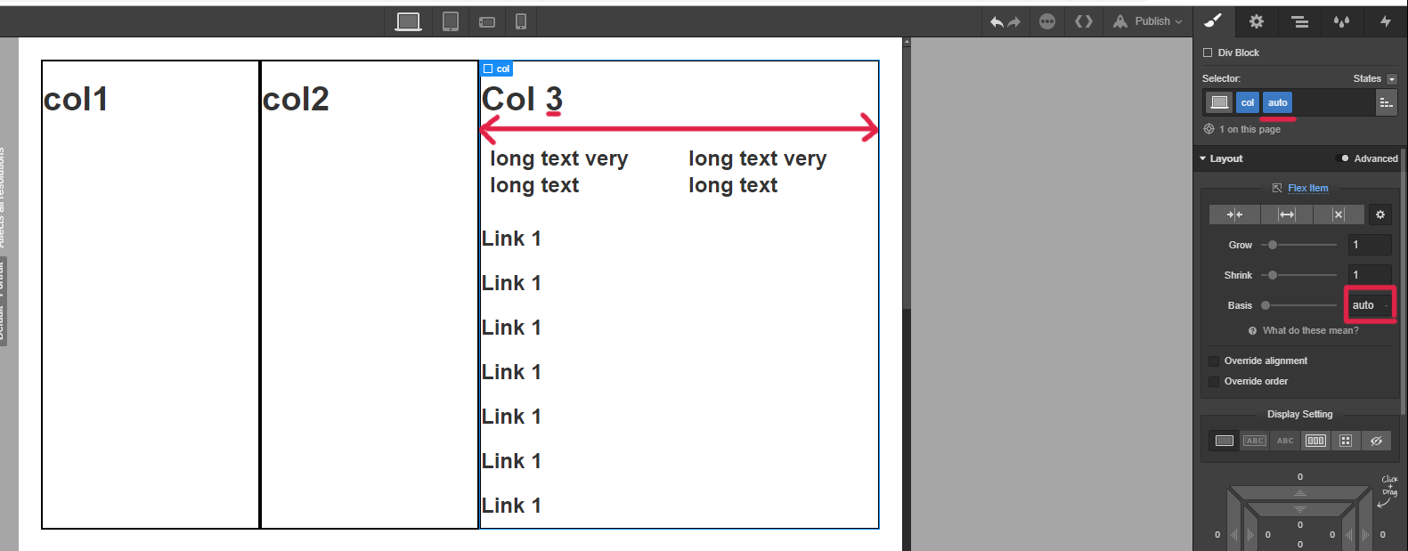
Now - set the width of col3 to auto
A flex-basis value set to auto sizes the element according to its size property. read more
IF Col3 is with same content like col1 and 2 - the result will be:
(so col1-33% // col2-33% // col3-auto (also 33%))
The main issue her - i dont know how you going to give your client control on col3 (Nested one or two cols).
Thanks for your suggestions, I will have a look, I was hoping there was a way that the columns would scale depending on whether the child was one or two column and that this could happen automatically, but maybe there is no way in CSS to achieve that. Will play with your suggestions now! Thanks.
The two lines issue (Seperate from the 3cols issue):
One more idea her (set col3 nested-div direction col; set the height of col3 to some value)
https://stackoverflow.com/questions/41959051/css-move-element-to-new-column-if-height-is-reached