I am having trouble with the grid shrinking in a weird position when I turn on the mobile screen.
It always shrinking the right first. I want them to shrink responsively with each other. I really have no idea now.
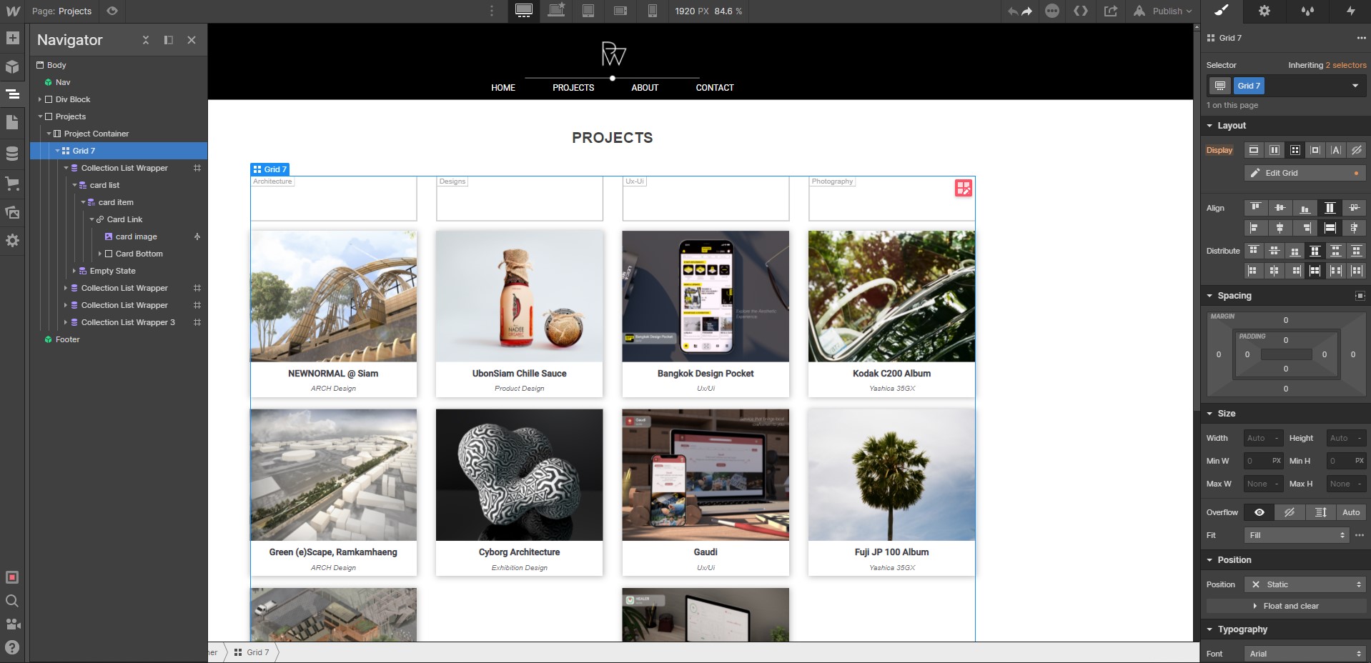
Hi @Poomipat_Waengsothor, thanks for your posts, I am not exactly sure what kind of layout you are going for on mobile, is it your intent to keep the four columns of collection lists showing vertically on mobile?
It seems that there is a “card image” class applied to two collection lists, but two without the class applied, i would make sure that all elements have the same class.
On the image, If you want the image to have a minimum width, I would set that in the card image class and give that a minimum width like 80px. If all images are same size and aspect ration, they will resize the same.
I also like to reduce the number of items on mobile portrait to just 1 or 2 across so that the content can be seen and read clearly, I most often go to a one column layout at the lowest viewport widths.