fullPage effect

Hello, I found this topic already but it’s closed so… (Fullpage.js scroll effect - General - Forum | Webflow)

I want my website to do this fancy full page scrolling effect and I tried it with this .js script: GitHub - alvarotrigo/fullPage.js: fullPage plugin by Alvaro Trigo. Create full screen pages fast and simple

I was wondering if anyone made it happened and if so, can you help me? I don’t know what I’m doing wrong.
Here’s my share link: https://preview.webflow.com/preview/mauricio-s-amazing-site?preview=0d128718f1fe18a8fca7199247973f0f
And the publish link: http://mauricio-s-amazing-site.webflow.io

I was working in a more complex site so I thought that in an basic design website I could have are it work. But it didn’t happen so…pleeeease anybody!

Thanks :slight_smile:

2 Likes

Hello, @mauribazan

Move these parts of script to the FOOTER custom code area:

<script src="https://ajax.googleapis.com/ajax/libs/jquery/3.0.0/jquery.min.js">
</script>

<script type="text/javascript">
	$(document).ready(function() {
    $('#fullpage').fullpage();
});
</script>

Let me know if it will help.

Regards,
Anna

Still the same :confused:

Am I writing the correct syntax for calling an external .css and .js?

Hello again, @mauribazan

My apology, I should notice it yesterday, you didn’t include the actual plugin js file. Also, you don’t really need the jquery library file, Webflow is already using it in every site.

So, you can add this line to the “header” part of custom code:

<link rel="stylesheet" type="text/css" href="https://cdnjs.cloudflare.com/ajax/libs/fullPage.js/2.8.1/jquery.fullPage.css">

and this part should go to the “footer” part:

`

`

And sure, you
Try this steps and let me know if it helps.

Regards,
Anna

Yeeeessss!! That worked really fine. Thank you!!!

Now I’m trying in the more complex site and the only problem I’m finding it’s that my sections heights stopped working in the mobile version -I don’t know the correct way to say it-. I think that the script changes all .section heights into 100%, but when I give it a responsiveWidth: 800, it’s still the same (it’s supposed to deactivate the scrolling effect)

Here are the links for you to check it out:
shared: https://preview.webflow.com/preview/colegio-santa-elena?preview=7aa186e6ebf021d4109237306678a6c0
published: http://colegio-santa-elena.webflow.io/

Any thoughts?

FYI: I solved the interaction problem other people had in the previous topic (scrolling interaction not working with this pluggin). If anyone it’s interested, you just have to set the scrollbar: true in the scrolling options.

2 Likes

@mauribazan I’m digging the fullpage effect! Nice work, definitely gonna try this out on one of my own projects.

One suggestion would be to vertically center your content on sections Programas y Actividades, flexbox makes this a walk in the park now.

Where exactly, could you show, please?

Thanks! Please, go for it! It’s just that it has some problems in the mobile version, so…I’m trying to figured out how to solve it.

Oh, vertically. Yeah, I was really trying to do the scrolling thing but you’re right, I’ll centered it, thanks!

In the same github page ( GitHub - alvarotrigo/fullPage.js: fullPage plugin by Alvaro Trigo. Create full screen pages fast and simple ) you have another way to call the script in which you can set some parameters. The complete script I’m currently using it’s like this:

<script type="text/javascript" src="https://cdnjs.cloudflare.com/ajax/libs/fullPage.js/2.8.1/jquery.fullPage.js"></script>
<script type="text/javascript">
var Webflow = Webflow || [];
Webflow.push(function() {
$('#fullpage').fullpage({
        //Navigation
        menu: '#menu',
        lockAnchors: false,
        anchors:['firstPage', 'secondPage'],
        navigation: false,
        navigationPosition: 'right',
        navigationTooltips: ['firstSlide', 'secondSlide'],
        showActiveTooltip: false,
        slidesNavigation: false,
        slidesNavPosition: 'bottom',

        //Scrolling
        css3: true,
        scrollingSpeed: 1000,
        autoScrolling: true,
        fitToSection: true,
        fitToSectionDelay: 1000,
        scrollBar: true,
        easing: 'easeInOutCubic',
        easingcss3: 'ease',
        loopBottom: false,
        loopTop: false,
        loopHorizontal: false,
        continuousVertical: false,
        normalScrollElements: '#element1, .element2',
        scrollOverflow: false,
        scrollOverflowOptions: null,
        touchSensitivity: 15,
        normalScrollElementTouchThreshold: 5,

        //Accessibility
        keyboardScrolling: true,
        animateAnchor: true,
        recordHistory: true,

        //Design
        controlArrows: false,
        verticalCentered: false,
        sectionsColor : ['#', '#'],
        paddingTop: '0px',
        paddingBottom: '0px',
        fixedElements: '#header, .footer',
        responsiveWidth: 800,
        responsiveHeight: 0,

        //Custom selectors
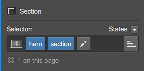
        sectionSelector: '.section',
        slideSelector: '',

        //events
        onLeave: function(index, nextIndex, direction){},
        afterLoad: function(anchorLink, index){},
        afterRender: function(){},
        afterResize: function(){},
        afterSlideLoad: function(anchorLink, index, slideAnchor, slideIndex){},
        onSlideLeave: function(anchorLink, index, slideIndex, direction, nextSlideIndex){}
    });
});
</script>

If you want anything different, you can read the hole document and it explains pretty well. So, you’ll just have to play around to really understand what each command does in practice.

Anyway, I’m not getting it work in mobile, that’s a big pain in the as* for me right now.

1 Like

Ok guys, I finally did it! With this great plugin called “scrollify”

Here’s the code:

<!--scrollify: http://projects.lukehaas.me/scrollify/-->

<script type="text/javascript" src=https://raw.githubusercontent.com/lukehaas/Scrollify/master/jquery.scrollify.js>
</script>

<script type="text/javascript">
var Webflow = Webflow || [];
if(screen.width >= 960) {
Webflow.push(function() {
        $.scrollify({
            section : ".section",
            sectionName : "section-name",
            interstitialSection : ".footer",
            easing: "easeOutExpo",
            scrollSpeed: 2100,
            offset : 0,
            scrollbars: false,
            before:function() {},
            after:function() {},
            afterResize:function() {}
        });
});        
}
</script>

As you can see, I also added an “if” to disable the interaction when in mobile because it was causing me trouble -because of the nature of my own content- But it can be as you want! I added the source as a comment in the code for you to explore it as you wish and personalized it every time!

Well, thank you all for your help and enjoy it!

2 Likes

Good job! It seems like this new plugin documentation even better. :slight_smile:

Hey Mauribazan,

Can you please guide me how to implement the “scollify” plugin.

Hi there! No problem. This is how I did it:
In every section I used, I added a class (or subclass, it’s the same) called “section”

Ex.:

Then I added this script in the “before body tag” of the page.

In the “interstitial section” part of the script I added the class that in my design did’t have 100% height.

I deactivated the script when the screen is equal or smaller than 960 px because I had problems when opening in mobile devices. You can modify that part too.

If you want further personalization like scrolling speed or any other thing like this I would recommend you to take a look at this link: http://projects.lukehaas.me/scrollify/

PS.: I’m just a designer (no clue of any coding stuff) but this worked for me, hope it’s what you’re looking for!

Sorry for the bad english too

Hey Mauri,

Thank you so much for your reply and help!

But I am still unable to get it to work. Please take a look at the link below.

https://preview.webflow.com/preview/revgrp?preview=ac41f7e04e5bf4da77656ca704906728

http://revgrp.webflow.io/home

I am working on it on the HOME page. Let me know what I am missing. Thanks again!

PS: your english is just fine :smile:

I think the tag has to be “section” and not “div”.

Try that! On each section of your home.

Oh! And you missed half of the script, you only copied until “sectionName”. You have to copy all the script!

Weird still not functioning.

I changed the tag and also copied the entire code.

I just went to your website and it’s working just fine!

You have to know that everything that you do with custom code it’s just going to work when published and not in the preview mode of webflow.

Enjoy it!

Hi @mauribazan

Thank you for spending time explaining. really appreciate it!
But I have the same problem as @Justxn.

There is a few things Im not sure of

You say, before the body tag on the page. you mean before < /body > tag right? And on page you mean on the page itself, no in the custom code section in settings?

I went in on your public link and I could see that you where using a code in the inside < head > tag area and a different code before < /body > tag

Where have you put the code you are showing us and what is all the other codes :slight_smile:

I get your page to work, but not mine. Don’t understand why…

Sharelink
public link

Ok, I think I know what’s happening. You’re using Chrome browser right? I think this script doesn’t work on Chrome, sorry for that!
Either way, I think “normal user’s” will navigate with either safari or explorer which I think work well with the script.
I remember I worked very hard to make this work but maybe you can find a better way to do it! If so, please post it here so we can all get a better solution for this.
It will be cool if webflow adds this as a native feature though!!!

Ok. :slight_smile:
I found a script from SidneyOttelohe that worked. See my latest code help post.

But “normal users” uses chrome. Its the most used browser in the world, so a script that doesn’t work with chrome is pretty much useless I would say. :slight_smile: