I have seen a few threads about this, but I created a custom menu from scratch that has a lottie animation in it. I got it close, but now the buttons and content below the full screen menu cannont be clicked on. I’ve attached a link for you if that hepls
@lukesouthern welcome to the community! I’m so glad that you’re here
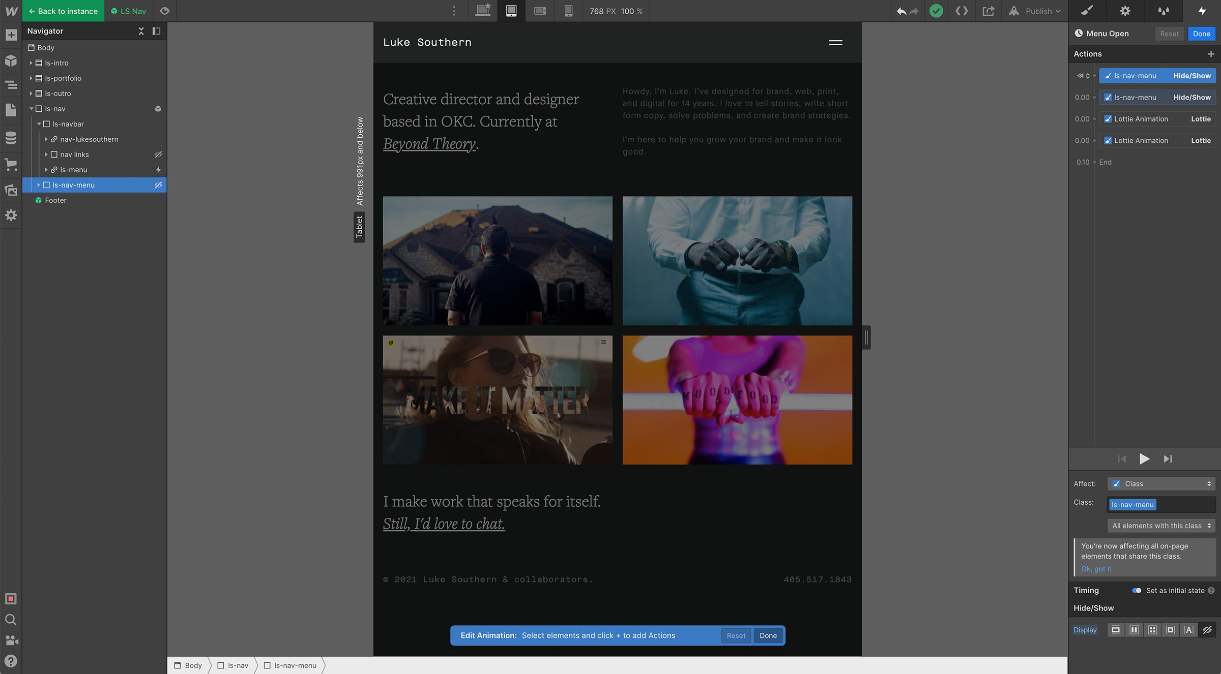
Can you please post some screenshots of what you’re observing? As well as let us know which page the navigation is on? I’m having trouble finding it, but I’m guessing that it’s a z-index issue where some content is overlaying on top of the links.
I have the nave in a symbol on the home page. I’ve been fiddling with it since this post and I have the menu built custom, and it’s set to fixed with display:none as the default. I have the lottie file wrapper linked with the animation to open the menu and earlier it was covering the contents of the page, now it’s like not working solid at all.
When I unlink the symbol it’s a bit better but is still getting hung up, FYI. I’m very new to the custom side of Webflow, so I apologize if this is very obvious
Thank you so much for letting me know @lukesouthern this design is looking beautiful!
I would highly recommend adding in a Navbar element instead of building a custom one. This way you select the navbar element use the open/close interactions to fire each interaction/animation. You can also replace the navbar hamburger menu with your lottie element. Building this out manually will likely have a few issues with open/close events and overall usability.
Steps to resolve:
Add in a navbar element
Add classes to the navbar which are on your current custom nav
Move the lottie file into the hamburger menu and delete the hamburger icon
Select the Navbar element
Go to interactions and choose the open/close interaction events
Update the interaction animations for opening and closing events accordingly
Create a symbol out of the new nav and add it to each of the pages, or add it to your existing symbol after deleting the former custom pieces which aren’t in the navbar element.
Please let me know if this is helpful or if you have any additional questions.
Thank you, I actually already have that. I need the desktop links to be limited to the “About” and “Contact” links only, and then the menu have more, and from what I understand, you can’t edit those separate, right?
Oh sweet! You can add classes to buttons like hide-on-desktop and then set the links which you don’t want to display on desktop to display:none, then set them to display:block on mobile breakpoints.
This way you have one navbar element, rather than multiple which can be difficult to manage at scale.
So I just need to use the standard navbar, but I can create a custom full screen menu, right? Then use the menu button to animate that on. I don’t like the slide top down, left, and right animations, so that’s why I’m prefering a fade on, if that makes sense. I’ve seen some videos of this online but they all seem to make custom navbars so I thought it was a good plan, but it’s just not working well
Do you have any recommendations for how to make a full screen menu without the standard menu animations? All I see is people building custom menus and nav, even on Webflow’s YouTube channel…
I’d love to be able to customize it with better animations if I can get some direction
If you set the duration of the build in animation event to 0ms then you can control the rest of the animation with a custom flow (you may need to drop in a div block to wrap the links within to animate the fade of that element):
Hi Waldo, I wanted to ask a quick question in this forum as I couldn’t find other solutions anywhere else, and this seems to be in the Nav category. I have a full screen custom menu also. When the user opens the menu at the top of the page the menu links are in the perfect position and it is exactly how I want the menu to look, however my problem occurs when I open the menu whilst half way down the page, when the menu is opened my menu links are still at the top so I cant see them. Is there a way that the menu links can be seen/viewed the same way they are when opened at the top of the page, however opening the menu where ever on the page. Hopefully that makes sense lol
Here is my read only link, and please refer to the mobile portrait view to review this issue.
 I’m so glad that you’re here


