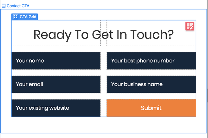
First real world use with grid, loving it.
Making a form here and placing the fields is easy as pie in a 2x3 grid.
Now, the question arises: for styling on mobile, how do you get the grid to cascade into what I’ll call a 1x6 (1 column, 6 rows), instead of 2 columns 3 rows…
Best I’ve been able to do is just change it to flex vertical/center… but that defeats grid.
Here is my site Read-Only: LINK
(how to share your site Read-Only link)


