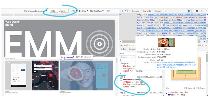
Trying to wrap this portfolio when I noticed a slight imbalance on resolutions higher than about 2000px. This is what really happens. The scaling of the projects looks good until that point, then just won’t scale to 100%, leaving a few pixels gap, the left column going lower that the right one.
I tried a few solutions found here, but the image will fill for a few seconds the container then it will snap back at save or publish.
EDIT: It might not happen in the read-only link share, so here’s also the published website: https://emm-933c3c.webflow.io/
Here is my site Read-Only: https://preview.webflow.com/preview/emm-933c3c?utm_medium=preview_link&utm_source=designer&utm_content=emm-933c3c&preview=30f6083c6277969746d26b6ebcbfa498&workflow=preview
