Hello Webdesigners,
Im relatively new to webflow, and about to finish my first paid platform.
But, (there’s always a but) the layout is different from my browsers to my clients.
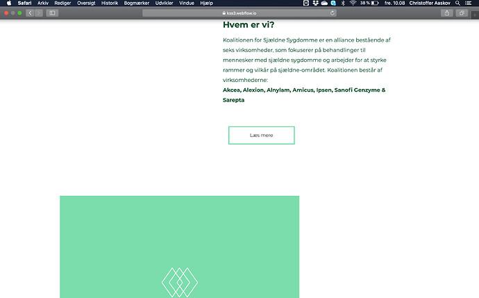
They’ve attached screenshots of the layout being ‘broken’ whereas in my browsers, it’s 100% responsive.
I’ve tried to do 100% width on all parents, using divs instead of columns, reset my cache and cookies with no luck.
Could it be the webkits not reading it properly or what is it? Slowly losing my mind here. Especially when i cannot see it with my own browsers or in webflow.
Anywho, any help is appreciated!
Here’s the website, let me know if you need anything else.
